How to install a Start Bootstrap theme on Ruby on Rails 4 using Sass?

I want to install a theme called Grayscale of Start Bootstrap and I don’t know how to do it.

Install a new Ruby on Rails by running >> rails new grayscale. Navigate to your project folder >> cd grayscale then run the following commands:

Sass / SCSS

>> git clone https://github.com/blackfyre/https://github.com/blackfyre/grayscale-sass.git.git
>> cd grayscale-sass
>> bower install
>> cd ..
>> mv app/assets/stylesheets/application.css app/assets/stylesheets/application.scss

Then edit app/assets/stylesheets/application.scss. This file should contain only the following line of code:

@import '../../../grayscale-sass/assets/sass/main.scss';

Javascipt

Edit app/assets/javascripts/application.js. This file should contain the code like that shown below:

//= require jquery
//= require jquery_ujs
//= require turbolinks
//= require_tree .


//= require grayscale-sass/assets/bower_components/jquery.easing/js/jquery.easing.js
//= require grayscale-sass/assets/bower_components/bootstrap/dist/js/bootstrap.js
//= require grayscale-sass/assets/js/grayscale.js

Views

Create a controller called “welcome” with an action called “index”, by running the following command:

>> bin/rails generate controller welcome index

The app/views/welcome/index.html.erb and app/views/layouts/application.html.erb should be edit according grayscale-sass/index.httml

index.html.erb

  <!-- Navigation -->
 <nav class="navbar navbar-custom navbar-fixed-top" role="navigation">
 <div class="container">
 <div class="navbar-header">
 <button type="button" class="navbar-toggle" data-toggle="collapse" data-target=".navbar-main-collapse">
 <i class="fa fa-bars"></i>
 </button>
 <a class="navbar-brand page-scroll" href="#page-top">
 <i class="fa fa-play-circle"></i> <span class="light">Start</span> Bootstrap
 </a>
 </div>

 <!-- Collect the nav links, forms, and other content for toggling -->
 <div class="collapse navbar-collapse navbar-right navbar-main-collapse">
 <ul class="nav navbar-nav">
 <!-- Hidden li included to remove active class from about link when scrolled up past about section -->
 <li class="hidden">
 <a href="#page-top"></a>
 </li>
 <li>
 <a class="page-scroll" href="#about">About</a>
 </li>
 <li>
 <a class="page-scroll" href="#contact">Contact Start Bootstrap</a>
 </li>
 <li>
 <a class="page-scroll" href="#download2">Download SASS</a>
 </li>
 <li>
 <a class="page-scroll" href="#contact2">Contact Blackfyre</a>
 </li>
 </ul>
 </div>
 <!-- /.navbar-collapse -->
 </div>
 <!-- /.container -->
 </nav>

 <!-- Intro Header -->
 <header class="intro">
 <div class="intro-body">
 <div class="container">
 <div class="row">
 <div class="col-md-8 col-md-offset-2">
 <h1 class="brand-heading">Grayscale</h1>
 <p class="intro-text">A free, responsive, one page Bootstrap theme.<br>Created originally by Start Bootstrap.</p>
 <a href="#about" class="btn btn-circle page-scroll pulse">
 <i class="fa fa-angle-double-down"></i>
 </a>
 </div>
 </div>
 </div>
 </div>
 </header>

 <!-- About Section -->
 <section id="about" class="container content-section text-center">
 <div class="row">
 <div class="col-lg-8 col-lg-offset-2">
 <h2>About Grayscale</h2>
 <p>Grayscale is a free Bootstrap 3 theme created by Start Bootstrap. It can be yours right now, simply download the template on <a href="http://startbootstrap.com/template-overviews/grayscale/">the preview page</a>. The theme is open source, and you can use it for any purpose, personal or commercial.</p>
 <p>This theme features stock photos by <a href="http://gratisography.com/">Gratisography</a> along with a custom Google Maps skin courtesy of <a href="http://snazzymaps.com/">Snazzy Maps</a>.</p>
 <p>This version of Grayscale includes full HTML, CSS, and custom JavaScript files along with SASS files and bower for an even easier customization.</p>
 </div>
 </div>
 </section>

 <!-- Contact Section -->
 <section id="contact" class="container content-section text-center">
 <div class="row">
 <div class="col-lg-8 col-lg-offset-2">
 <h2>Contact Start Bootstrap</h2>
 <p>Feel free to email us to provide some feedback on our templates, give us suggestions for new templates and themes, or to just say hello!</p>
 <p><a href="mailto:feedback@startbootstrap.com">feedback@startbootstrap.com</a>
 </p>
 <ul class="list-inline banner-social-buttons">
 <li>
 <a href="https://twitter.com/SBootstrap" class="btn btn-default btn-lg"><i class="fa fa-twitter fa-fw"></i> <span class="network-name">Twitter</span></a>
 </li>
 <li>
 <a href="https://github.com/IronSummitMedia/startbootstrap" class="btn btn-default btn-lg"><i class="fa fa-github fa-fw"></i> <span class="network-name">Github</span></a>
 </li>
 <li>
 <a href="https://plus.google.com/+Startbootstrap/posts" class="btn btn-default btn-lg"><i class="fa fa-google-plus fa-fw"></i> <span class="network-name">Google+</span></a>
 </li>
 </ul>
 </div>
 </div>
 </section>

 <!-- Download SASS Section -->
 <section id="download2" class="content-section text-center">
 <div class="download-section">
 <div class="container">
 <div class="col-lg-8 col-lg-offset-2">
 <h2>Download Grayscale</h2>
 <p>You can download the SASS version of Grayscale for free on the GITHUB page.</p>
 <a href="https://github.com/blackfyre/grayscale-sass/" class="btn btn-default btn-lg">Visit the Download Page</a>
 </div>
 </div>
 </div>
 </section>

 <!-- Contact Section -->
 <section id="contact2" class="container content-section text-center">
 <div class="row">
 <div class="col-lg-8 col-lg-offset-2">
 <h2>Contact Blackfyre</h2>
 <p>If you have problems with the <b>SASS version</b> of the original template, please report it at the</p>
 <p><a href="https://github.com/blackfyre/grayscale-sass/issues">GITHUB Issues page</a>
 </p>
 <ul class="list-inline banner-social-buttons">
 <li>
 <a href="https://twitter.com/gnick666" class="btn btn-default btn-lg"><i class="fa fa-twitter fa-fw"></i> <span class="network-name">Twitter</span></a>
 </li>
 <li>
 <a href="https://github.com/blackfyre" class="btn btn-default btn-lg"><i class="fa fa-github fa-fw"></i> <span class="network-name">Github</span></a>
 </li>
 </ul>
 </div>
 </div>
 </section>


 <!-- Map Section -->
 <div id="map"></div>

 <!-- Footer -->
 <footer>
 <div class="container text-center">
 <p>Copyright &copy; Your Website 2014</p>
 </div>
 </footer>

 <!-- Google Maps API Key - Use your own API key to enable the map feature. More information on the Google Maps API can be found at https://developers.google.com/maps/ -->
 <script type="text/javascript" src="https://maps.googleapis.com/maps/api/js?key=AIzaSyCRngKslUGJTlibkQ3FkfTxj3Xss1UlZDA&sensor=false"></script>


application.html.erb

<!DOCTYPE html>
<html>
<head>
 <title>Grayscale</title>
 <%= stylesheet_link_tag 'application', media: 'all', 'data-turbolinks-track' => true %>
 <%= csrf_meta_tags %>
</head>
<body id="page-top" data-spy="scroll" data-target=".navbar-fixed-top">

<%= yield %>
<%= javascript_include_tag 'application' %>
</body>
</html>

Fonts

>> cp -r grayscale-sass/fonts public

Images

>> cp -r grayscale-sass/assets/images public

Test

Now you can run >> bin/rails server and open http://localhost:3000/welcome/index in your browser. The result now should look like that shown in the figure beneath:
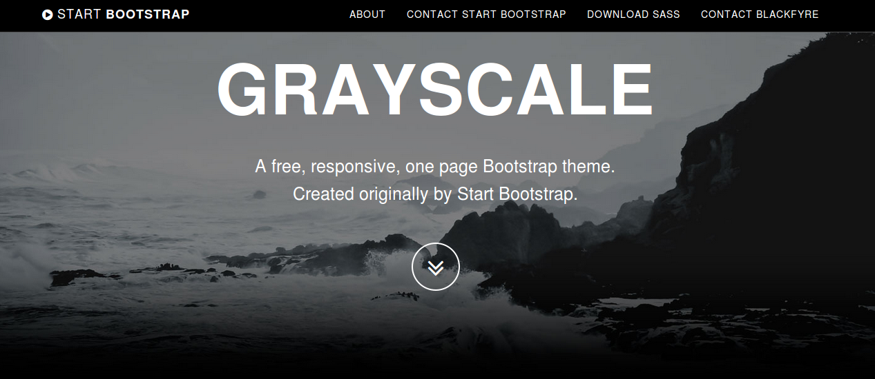
 grayscale

How to change Bootstrap’s carousel animation

The popular carousel plugin of Bootstrap has been used on many websites. The jQuery plugin itself uses CSS class from the Less code of Bootstrap. So you can not change the classes names use for the carousel structure (without changing the plugin too).

In most situations you will not change the original source code of Bootstrap, to make easy updating possible.

In stead of changing the class name you can add an additional class to bind new animations to the carousel.

An example can be found at: http://www.bootply.com/Tbey4dxan1

For the example above i have add a anim class to the div with the role="listbox" as follows:

<div class=”carousel-inner anim” role=”listbox”>

After that i can use the carousel-inner anim in the Less code for my alternative animations. The carousel-inner anim selector automatically got a higher specificity than the original carousel-inner selector.

For the demonstration i have use two animations from Animate.css. The Less code for the flip animation will look like that shown below:

@keyframes flip {
0% {
transform: perspective(400px) rotate3d(0, 1, 0, -360deg);
animation-timing-function: ease-out;
}

40% {
transform: perspective(400px) translate3d(0, 0, 150px) rotate3d(0, 1, 0, -190deg);
animation-timing-function: ease-out;
}

50% {
transform: perspective(400px) translate3d(0, 0, 150px) rotate3d(0, 1, 0, -170deg);
animation-timing-function: ease-in;
}

80% {
transform: perspective(400px) scale3d(.95, .95, .95);
animation-timing-function: ease-in;
}

100% {
transform: perspective(400px);
animation-timing-function: ease-in;
}
}

.flip {
backface-visibility: visible;
animation-name: flip;
animation-duration: 0.6s;
}

I have add the animation-duration property into the .flip selector, which can be used as mixin now. Notice that CSS animation require some vendor prefixes for cross browser compatibility. I do not use vendor prefixes in my Less code but run an autoprefixer afterwards leveraging the Less Autoprefix plugin. After creating the Less code for the animation, i will create the Less code carousel-inner anim selector, which will look as follows:

.carousel-inner.anim {

> .active {
left: 0;
}

> .next,
> .prev {
position: absolute;
top: 0;
width: 100%;
}

> .next.left {
.flip();
left: 0;
}
> .prev.right {
.rotateInDownLeft();
left: 0;
}
> .active.left {
left: -100%;
}
> .active.right {
left: 100%;
}
}

I also found some related questions on Stack Overflow;
http://stackoverflow.com/questions/26770055/bootstrap-carousel-fade-no-longer-working-with-maxcdn-3-3-bootstrap-min-css and http://stackoverflow.com/questions/27626096/bootstrap-carousel-fade-not-working-on-images-need-help-understanding-why.

I have tested the above solutions on both Chrome and Firefox. In some situations (or for some browsers) you should possible also reset the original transitions. You could try to do this reset by using the following Less code:

.carousel-inner {

> .item {
transition: none;

// WebKit CSS3 transforms for supported devices
@media all and (transform-3d), (-webkit-transform-3d) {
transition: none;
backface-visibility: hidden;
perspective: 1000;

&.next,
&.active.right {
transform: none;
left: 0;
}
&.prev,
&.active.left {
transform: none;
left: 0;
}
&.next.left,
&.prev.right,
&.active {
transform: none;
left: 0;
}
}

}
}


Howto smoothly fade in your slides

For fade-out and fade-in effect, your slides should be stacked (using position absolute). An demo can be found here. For a more detailed explanation you should read my answer at stackoverflow: Bootstrap carousel refuses to transition smoothly after css adjustments. This example will also show you that the Bootstrap 3d-translations can indeed easily be reset by using the following Less code:

.carousel-inner > .item {
transform: translate3d(0,0,0) !important;
}


Compile Bootstrap with Less v2 and the autoprefix plugin

Since Bootstrap v3.2 the grunt autoprefixer plugin is part of Bootstrap’s build process. This autoprefixer postprocessor makes the prefix mixins (found in less/mixins/vendor-prefixes.less) deprecated.

Less 2 introduced plugins for the Less compiler, see also http://lesscss.org/usage/#plugins. These plugins enables you to add your own postprocessors. Postprocessors change the compiled CSS code. An example can be found at: http://stackoverflow.com/a/26539622/1596547

Less provides its own autoprefixer plugin now. Leveraging the Less autoprefixer plugin enables you to compile the Bootstrap CSS without running Grunt.

  1. Download and unzip Bootstrap’s source files. These files can be found at: https://github.com/twbs/bootstrap/archive/v3.2.0.zip
  2. When you have not done yet. Update Less to version 2: npm -g update less
  3. Than install the autoprefix plugin by running npm -g install https://github.com/less/less-plugin-autoprefix/archive/master.tar.gz (soon you should be able to run npm -g install less-plugin-autoprefix too)(for now run npm install https://github.com/less/less-plugin-autoprefix/archive/master.tar.gz, which install the latest version and supports options)

Now you can compile Bootstrap’s CSS by running in your console:
lessc --autoprefix='Android 2.3,Android >= 4,Chrome >= 20,Firefox >= 24,Explorer >= 8",iOS >= 6,Opera >= 12,Safari >= 6' less/bootstrap.less bootstrap.css

The autoprefix plugin takes care for your v3 source maps too, when running the compiler with the --source-map or --inline-source-map option. Use the compiler’s -x open to compress your compiled CSS code. Since Less v2 the clean-css option has also been moved into in plugin. You can install the clean-css plugin by running npm install less-plugin-clean-css.

Bootstrap 3.2.0 and Shrinkwrap

When running npm install with the latest 3.2.0. release of Bootstrap I found the following error:

Loading "Gruntfile.js" tasks...ERROR
>> AssertionError: args.type is required
Warning: Task "dist" not found. Use --force to continue.

This issue can be solved by running the grunt update-shrinkwrap task just after npm install.

With version 3.2.0. Booststrap switch to the npm version of shrinkwrap. Shrinkwrap locks down the versions of a package’s dependencies so that you can control exactly which versions of each dependency will be used when your package is installed.
The Shrinkwrap task should be run whenever Bootstrap’s dependencies change and so you will have to run it after npm install.

A11Y Buttons

The JBST WordPress Theme meets WordPress.org’s Accessibility Guidelines. I think accessibility support is important. Recently i got a e-mail from Nick, Co-founder of HKC radio.

Nick told me JBST default navbar buttons don’t have a label or title. The login button has a title when logged in, but when not logged in the button only identifies itself as ‘button’.

After reading Nick’s e-mail i found the excellent blog post of Nicholas C. Zakas: Making accessible icon buttons.

There seems two ways around to solve this button problem. The first solution adds aria-label attribute to the buttonHTML element. Whilst the second solution uses an additional spanelement which is hidden for non-screenreader by the JBST’s built-in sr-only class.

I create a sample for page for both solutions, this page also includes the current situation, could you tell me which solution you prefer and why? Or do we need a combination of these solutions?

Please also let me know when the button dropdowns got any accessibility issue.

Adding a background gradient to Bootstrap’s navbar with Less

When writing a book about Less and have to answer a question about adding a background gradient to JBST’s navbar the answer was found easy. Bootstrap’s navbar is styled with two CSS classes the .navbar class sets it’s structure while the .navbar-default or .navbar-inverse classes add colors and other styling. Bootstrap’s mixins contain also mixin for CSS3 background gradients. With the preceding knowledge adding a background-gradient will be as simple as writing in Less:

.navbar-default {
#gradient > .vertical(lighten(@navbar-default-bg,10%),darken(@navbar-default-bg,10%));
}

You should append this code to bootstrap.less and recompile Bootstrap. After recompiling the default navbar will be look like that shown below:

Twitter's Bootstrap default navbar with background gradient

Who don’t want to recompile Bootstrap can try to use the compiled CSS directly:

.navbar-default {
background-image: -webkit-linear-gradient(top, #ffffff 0%, #dfdfdf 100%);
background-image: linear-gradient(to bottom, #ffffff 0%, #dfdfdf 100%);
background-repeat: repeat-x;
filter: progid:DXImageTransform.Microsoft.gradient(startColorstr='#ffffffff', endColorstr='#ffdfdfdf', GradientType=0);
}

In the above you should find the values for #ffffff (white, lightest color) and  #dfdfdf (darkest color) yourself.

With Less changing the default background will be easy to:

.navbar-default {
#gradient > .vertical(lighten(@navbar-default-bg,10%),darken(@navbar-default-bg,10%));
}
@navbar-default-bg: purple;

The above will give you a purple gradient as background. Or the horizontal gradient variant:

.navbar-default {
#gradient > .horizontal(lighten(@navbar-default-bg,10%),darken(@navbar-default-bg,10%));
}
@navbar-default-bg: red;

All the above don’t restrict you to use the @navbar-default-bg only, you can choose your own colors or even use the three colored horizontal gradient:

.navbar-default {
#gradient > .horizontal-three-colors(red;white;50%;blue);
}

Which makes your navbar let’s look like shown below:

Twitter Bootstrap 3 navbar with three colors gradient

Buttons

You can also add a gradient to the Bootstrap’s default button with Less in the same way. The CSS classes of these buttons have the same structure as the navbar, the .btn class makes the button and a second class adds it’s styles. Except from the link button there are six default button styles in Bootstrap. To add a gradient to these button you can use the Less code shown below:

// add gradient to alternate buttons
// --------------------------------------------------

.btn-default {
#gradient > .vertical(lighten(@btn-default-bg,10%),darken(@btn-default-bg,10%));
}
.btn-primary {
#gradient > .vertical(lighten(@btn-primary-bg,10%),darken(@btn-primary-bg,10%));
}
// Success appears as green
.btn-success {
#gradient > .vertical(lighten(@btn-success-bg,10%),darken(@btn-success-bg,10%));
}
// Info appears as blue-green
.btn-info {
#gradient > .vertical(lighten(@btn-info-bg,10%),darken(@btn-info-bg,10%));
}
// Warning appears as orange
.btn-warning {
#gradient > .vertical(lighten(@btn-warning-bg,10%),darken(@btn-warning-bg,10%));
}
// Danger and error appear as red
.btn-danger {
#gradient > .vertical(lighten(@btn-danger-bg,10%),darken(@btn-danger-bg,10%));
}

After appending this to to bootstrap.less and recompiling Bootstrap your buttons will look like:

Twitter Bootstrap 3 buttons with background gradient

Also for button you are not restricted to Bootstrap’s default colors, try for instance:

.btn-custom {
.button-variant(black; white; white);
#gradient > .horizontal-three-colors(red;white;50%;blue);
}

Twitter Bootstrap custom button with three colors gradient


Also read:


Integrate LESS in JBST WordPress Theme

The WP LESS plugin offers a good opportunity to integrate LESS in your WordPress theme. How does this fit JBST? First i try to set the requirements.

JBST is based on Twitter’s Bootstrap, so we will have the option to update Twitter’s Bootstrap without changing any custom setting or extensions. JBST WordPress Theme can be use in two ways. In the first place someone can use JBST direct. In this case the website will be styled by using the build in customizer.
In the second option a child theme will be create. Customizing and styling will be done with the use of filters and hooks.
Updating of Twitter’s Bootstrap should be possible in both cases.
To find a suitable strategy i read Twitter Bootstrap Customization Best Practices. The solution of @sam seems to fit on the first sight. From How can I customize Twitter Bootstrap’s CSS using LESSCSS variables? i could construct a file structure.

Basically theme should compile customization.less which include Bootstrap. By default it always includes the bundled Bootstrap version. Compromise here will be the hard code path to Bootstrap’s LESS files:

@import ../../jamedobootstrapstarttheme/less/bootstrap.less
//custom Less code here

After this other CSS of JBST should also have to migrate to LESS. I will define a master and an custom file for this task too. So the final directory structure will look like:

/assets/bootstrap/less/*
/assets/jbst/less/*
/assets/less/boostrapcustomization.less
/assets/less/jbstcustomization.less

The plugin mentioned above should enqueue boostrapcustomization.less and jbstcustomization.less from the child theme folder if exists in the case of child theming or from the JBST parent theme in all other cases. Core files will always be imported from the parent theme. Updating Bootstrap won’t effect customizations.

So far the theoretical part. What did we find in practical? The first issue we found. The plugin didn’t support Twitter’s Bootstrap > 3.0.0. I fixed this by create a fork of the plugin which replies on less.php instead of LESSPHP. If your are interested you can download this code here.

Second issue was JBST doesn’t use the original Bootstrap files. Different versions of navbar.less are compiled and include based of the grid and navbar breakpoint (grid-float-breakpoint) settings in the customizer. To fix this we should save the customizer setting direct in some .less file (overriding bootstrap/variables.less).

Third JBST provides a custom CSS editor, this editor should be replace by a LESS editor.

The information in this blog will be used to migrate JBST to LESS. First steps are made already.

Custom Navbars in Twitter’s Bootstrap 3

Update: Also read Adding a background gradient to Bootstrap’s navbar with Less

Everyone knows the navbars for navigation from Twitter’s Bootstrap 2. In version 3 the structure has been changed a little, also see Twitter’s Bootstrap 3 RC2 (important changes). The navbar intends to be the main navigation on a website. When using more navbars on the same page you will have to set the z-index manually. Twitter’s Bootstrap 3 add accessibility to the navbar by adding a direct link with a special sr-only class. This sr-only class is visible in screen readers only.

Twitter’s Bootstrap 3 provides four types of navbars. The default navbar, a static navbar on the top of the document and navbar fixed to top or bottom of the document. See Navbar Docs for some example code to add a nav-tag with navbar to your website. To style your navbar you need to add the navbar-default class always. Of cource you could use a custom class or the navbar-inverse class too.

The best way to create a custom navbar (class) will be changing the Less variables and (re)compile your own version of Bootstrap’s CSS. See also: Change navbar color in Twitter Bootstrap 3

The look of the (default) navbar has been changed with Twitter’s Bootstrap 3. Gradients of the background are dropped also the dividers between links seems to miss.
Default Navbar with dividers in Twitter’s Bootstrap 2.x:
Twitter's Bootstrap 2.x navbar with dividers

Default Navbar in Twitter’s Bootstrap 3:

Twitter's Bootstrap 3 default navbar

I also create a custom Navbar generator for those who don’t want to compile the CSS. This generator has the option to add a background gradient and borders to your navbar. The borders can be used instead of the former dividers.

Navbar generated with the navbar generator:
Navbar Twitter Boosstrap 3

An other example:
Purple navbar

Twitter’s Bootstrap 3 RC2 (important changes)

The release candidate 2 of Twitter’s Bootstrap 3 shows some important changes. I decide to write a separate blog for it. Before start reading read first to get an idea of the changes between Twitter’s Bootstrap 3 and Twitter’s Bootstrap 2.

Grid

RC2 shows new grid class prefixes: col-xs-* for mobile devices follow by col-sm-* (tablet), col-md-* (laptop) and col-lg-* (desktop). The grid is fluid by default still. Gutter between the columns are replaced with a padding on both sides of the row. See the table below for a total view:

Twitter's Bootstrap Grid
Twitter’s Bootstrap Grid

I will show you an example of the use of the grid. Consider this example html:


<div class="container">
<div class="row">
<div class="col-xs-6" style="background-color: pink;">Pink</div>
<div class="col-xs-6" style="background-color: purple;">Purple</div>
</div>
<div class="row">
<div class="col-sm-6" style="background-color: pink;">Pink</div>
<div class="col-sm-6" style="background-color: purple;">Purple</div>
</div>
<div class="row">
<div class="col-sm-6 col-md-4" style="background-color: pink;">Pink</div>
<div class="col-sm-6 col-md-8" style="background-color: purple;">Purple</div>
</div>
<div class="row">
<div class="col-sm-6 col-md-4 col-lg-2" style="background-color: pink;">Pink</div>
<div class="col-sm-6 col-md-8 col-lg-10" style="background-color: purple;">Purple</div>
</div>
</div>

On large desktops (screenwidth >=1200px) this will look like:

1200

Note the `col-lg-10` are applied on the fourth row.

Laptops >= 992px will look like (grid-md-* will be applied on the third and fourth row):

980

Tabets >= 768px:

768 On the first row col-xs-6 has been applied. The next three rows are split with col-sm-6.

<768px:

extra small grid for mobile phones

All rows stack except from the first. The first row got col-xs- for the extra small grid which never stack.

So the col-xs-* will never stack as you see. col-xs-* will always be applied (make the grid horizontal) while the other classes are applied above their breakpoint. Also see the difference between col-xs-* and col-sm-* in the mobile view. Beside the break-points all grids have a max-container size too. To build your templates you could use this default grid, but variations between breakpoints are possible also.

The Jamedo’s Bootstrap Start Theme use a max-container size of 1200 pixels in combination with the Small grid by default. To build a non responsive site TB advice too use the Extra Small Grid with a fixed contianer size, see http://getbootstrap.com/getting-started/#disable-responsive. Read more about non responsive sites with TB3: .

Also realize there is no breakpoint at 480px at the moment. This breakpoint can be used for different views for phones landscape and portrait. See also: Missing the col-ts-* (tiny to small) set of classes?

Althought the gutters are replaced with padding the Less files and the current version of the customizer still define a @grid-gutter-width. This value is used to calculate inner padding of the columns which is @grid-gutter-width/2 = 15 pixels on each side. The margins on the left and the right side of the grid are filled with a negative margin of @grid-gutter-width/2 px too.

Classes for offsets, pull and push are availiable for all grids except the Extra Small grid. The classes have names like .col-sm-offset-* and .col-lg-pull-*.

Other changes in RC2

Glyphicons are back. Twitter’s Bootstrap 3 includes 180 glyphs in font format from the Glyphicon Halflings set. Free of cost and so they ask for a backlink to Glyphicons.com.

Stucture of the navbar has been changed a little. TB3 provide four types of navbars: The default navbar, Static top navbar and fixed navbar top and bottom. See the examples on the Get started page.

Try to check the migration section in the docs to explorer the complete set of changes.

Twitter’s Bootstrap 3 also pays attention to accessibility. They intoduce a new class `sr-only` only visible for screen readers (See: http://a11yproject.com/posts/how-to-hide-content/). You can use it to build links to the main content on the top of your document of navbar like:

<body>
  <a href="#content" class="sr-only">Skip to content</a>
  <div class="container" id="content">
    The main page content.
  </div>
</body>

They also ask your attention for the logical structure of your header elements (<h1> ... <h6>). Default Bootstrap font sizes help you to make your visual (formatted) style consistent with the semantic structure. Screen readers use this semantic stucture to build a table of contents of your document. Consider to not change the font sizes by css but choose the subordinate heading element which fits the semantic structure too. See also: Headings and Subheadings.

New elements elements make it possible to construct b.e. a Listgroup with badges:

Listgroup with badges

Last but not least provides RC2 an example of a Bootstrap Theme constructed in Less: http://getbootstrap.com/examples/theme/

It’s a shame! The newest version of Github’s most popular project is not backward compatible

Yes, i’m talking about Twitter’s Bootstrap. Release Candidate 2 of version 3 of Bootstrap 3 has been released today. And we will find at least class name changes again, see: What is wrong with Bootstrap 3 RC2. Is there a reason to be not backward compatible? No. Or maybe…. you will need some extra CSS code which could slow down your site. Unless you didn’t use the responsive features of version 2.x. Twitter’s Bootstrap 3 can’t be used without the responsive code any more.
The real reason to be not backwards compatible will be the new mobile first approach, i think. To adopt this approach you will have to change the structure of your CSS loading. You will have to work from small to big. I wonder what the benefits of the mobile first approach are nowadays. I understand some older smart phones don’t handle all css3 features or not even Javascript. Of course it would be nice when all this old phone users will see a nice looking and well functioning website.
But who has such old phone and why? Most people buy the newest phone every week. Maybe not every week but certainly often.
I also bet most web designers never check their site on a ‘old’ phone. They will load the site on their newest i-Phone via broadband wifi and say: Wooh that looks cool.
Maybe this the problem with Twitter’s Bootstrap too. It’s cool.
Should we rename everything? Why not? Everybody will happy with this new stuff, they don’t care.

If the mobile first approach really reduce load time / data traffic mobile users will profit a little. But Mobile Internet will become faster and faster and this happens sooner and sooner.

Should you migrate your website from Twitter’s Bootstrap 2.x to 3?

I don’t think so. With Twitter’s Bootstrap you already have chosen a progressive technology. Your website will be responsive and fit mobile users needs too. New browsers and techniques won’t work with 2.x in future. But also consider the mean life time of a / your web design. Twitter’s Bootstrap drops support for IE7 and FF3 (check the facts here: IE10 blows past IE7 and IE6′s combined market share, Firefox gains too, but Chrome hits 21-month low ). Beside browser support the typehead plugin is also dropped.

Should you build your new website with Twitter’s Bootstrap 3?

You could consider it at least (after the final release). Read also: Writing Twitter’s Bootstrap with upgrading to v3 in mind. If you used 2.x before you should learn some new things.
Except from the backwards compatible their seems nothing wrong with the new 3 version. The new small grid will make happy the modern phone users. The grid is fluid by default now, so you will have to study the profits and disadvantages of this when you used to the fixed layout.

What are the alternatives? Personal i love the idea behind (css) frameworks with a grid. I should never consider to write all the media queries, browser compatible css. etc. myself again. Zurb’s Foundation can be an alternative. (Is Bootstrap 3 RC 1 ready for production?).

New techniques / insights decouple CSS from HTML. This will make future migrations less painful maybe. So also read this post: Migrating from Zurb Foundation / Twitter Bootstrap to Bourbon & Neat. It refers to Bourdon and Neat. As they say: “it relies entirely on Sass mixins and does not pollute your HTML”. This combination looks promising too.