Twitter Bootstrap 3 breakpoints and grid

Release Candidate 2 has important changes for the grid and the grid classes. Read Twitter’s Bootstrap 3 RC2 (important changes)

Twitter Bootstrap 3
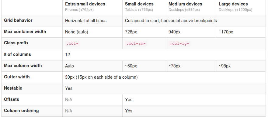
The most important changes in Twitter Bootstrap 3 will be the more mobile-first approaching and the grid. From now Twitter’s Bootstrap defines three grids: Tiny grid for Phones (<768px), Small grid for Tablets (<992px) and the Medium-large grid for Destkops (>992px). The row class prefixes for these grid are “.col-”, “.col-sm-” and “.col-lg-”. The Medium-large grid will stack below 992 pixels screen width. So does the Small grid below 768 pixels and the tiny grid never stacks. (updated for Twitter’s Bootstrap3 RC1)

Twitter’s Bootstrap 2 defines breakpoints at 480px, 768px, 980px and 1200px. The layout will always be fluid below 768px.

For this reason the ‘old’ span* will not be the same as col-* or col-lg-*. So replacing the class names in your templates will be give you better results. But when looking to an example like http://examples.getbootstrap.com/jumbotron/index.html you will find the the col-lg-* class in place of the former span* class.

Twitter's Bootstrap 3 Grid

Breakpoints

In variables.less you will find:

// Media queries breakpoints
// --------------------------------------------------

// Extra small screen / phone
@screen-xsmall:              480px;
@screen-phone:               @screen-xsmall;

// Small screen / tablet
@screen-small:               768px;
@screen-tablet:              @screen-small;

// Medium screen / desktop
@screen-medium:              992px;
@screen-desktop:             @screen-medium;

// Large screen / wide desktop
@screen-large:               1200px;
@screen-large-desktop:       @screen-large;

// So media queries don't overlap when required, provide a maximum
@screen-small-max:           (@screen-medium - 1);
@screen-tablet-max:          (@screen-desktop - 1);
@screen-desktop-max:         (@screen-large-desktop - 1);

// Grid system
// --------------------------------------------------

// Number of columns in the grid system
@grid-columns:              12;
// Padding, to be divided by two and applied to the left and right of all columns
@grid-gutter-width:         30px;
// Point at which the navbar stops collapsing
@grid-float-breakpoint:     @screen-tablet;

When i test this values if found something different:

  • “col-*” will be applied always (never stacks)
  • “col-sm-*” will be applied between 768 and higher (992px) (stacks at 767)
  • “col-lg-*” will be applied between 992 and higher (stacks at 991)

NOTE: @screen-small is not in use at the moment.

See also http://examples.getbootstrap.com/grid/ for more examples of the grids.

The grid of Twitter Bootstrap 3 has been change to fluid by default. Twitter Bootstrap 3 has only one breakpoint. We will find this breakpoint at 768 pixels. This breakpoint splits small screens and large screens.

Both sides of the breakpoint have a 12 column wide grid. Only modern phone will use the mobile grid, older phoned should only stack. Class names for span and offset are change to col-span-* and -*. Also Twitter Bootstrap 3 introduce new classes (col-small-span-*) for stacking in the mobile grid. You will use this new classes in combination with the standard span and offset classes for large devices:

Imagine you will add two image next to each other in a row.

Twitter Bootstrap 2: (old situation)

<div class=”row”>
<div class=”span6″><img src=”image1.png”></div>
</div>

On small screens the images will stack with a 100% width in a fluid layout.

Twitter bootstrap 3:

<div class=”row”>
<div class=”col-span-6″><img src=”image1.png”></div>
</div>

Without adding the mobile classes the images will don’t use the mobile grid and stack with 100% width.
(Note this differs from my expectation. I expected the main classes also should influence the mobile grid.)

no grid

Now we could add the new classes and let the images show next to each other with 50% width:

<div class=”row”>
<div class=”col-span-6 col-small-span-6″><img src=”image1.png”></div>
</div>

grid

You can also use this class to change the way of stacking:

<div class=”row”>
<div class=”col-span-4 col-small-span-12″><img src=”image1.png”></div>
<div class=”col-span-4 col-small-span-6″><img src=”image1.png”></div>
</div>

So we lost some breakpoints but got a small device grid back. Remember offsets are not available with the small grid. Two other new classes are col-pull-* and col-push-*. This classes help you to change the order of your columns. Also these classes are not available with the small grid.

Large screens

The new fluid grid without a default width also lets me think about large screens again. Should i made a decision about the max width of my site when viewed on a large screen? Users who use a site on an large screen with a full screen browsers window should have a reason to do so. So it seems to be more user friendly to let the user choose the max width. I found an interesting article about this: Life Beyond 960px: Designing for Large Screens. At the moment the .container class provides max-widths (728px, 940px en 1170px) for the large grid.

Twitter Bootstrap Templates

twitter bootstrapTwitter Bootstrap is a front-end toolkit for rapidly developing web applications and websites. It is a collection of CSS and HTML conventions. Twitter Bootstrap is built on LESS. LESS extends CSS with dynamic behavior such as variables, mixins, operations and functions. At the moment i build most website and webapplications with Twitter Bootstrap. Examples Streetart.nl, PKDigitaal, Gizzing and JongerenChat (under construction) and many others.
Most of these websites are build with OpensourceCMS.eu which has been rebuild with Twitter Bootstrap.
Jamedo websites also offers responsive webdesign based on Twitter Bootstrap. Jamedo websites uses the excellent framework of Skematik for WordPress in most cases. Skematik is a GPL WordPress theme + framework designed with Twitter Bootstrap to be the best thing for WordPress ever. With Skematik Jamedo Website build sites like Bougemagic.
The examples above show you can build fantastic responsive websites with Twitter Bootstrap. Of course you will prevent you website looks Bootstrap-y. Many bootstrap website have horizontal menu / navigation. Horizontal elements are easier to implement in a responsive design. But remember you are no restrict to. To create responsive vertical menus you could use for instance Superfish. Superfish is an enhanced Suckerfish-style menu jQuery plugin that takes an existing pure CSS drop-down menu (so it degrades gracefully without JavaScript).
I create Twitter Bootstrap templates you can download for free from github. You can use them to see the technics used to build them. To use them in a production environment you will need a designer definitely.
The first example template is a One Page Sale design. The page has a responsive slider (example page without slider is include too). You can add your product or service, special offers, usp and testimonials. An order page is include too.
The second template set shows you a web shop with vertical menu. Included are homepage, product page, categories and search page.

The Free Twitter Bootstrap Webshop Template set is available for Twitter Bootstrap 3 now. Also read: Migrate your templates from Twitter Bootstrap 2.x to Twitter Bootstrap 3

twitter bootstrap web shop template

Bootstrap your (designer’s) mind

bootstrap your mindMost websites are built responsive nowadays. I use Twitter Bootstrap to build responsive websites. Twitter Bootstrap is a front-end toolkit for rapidly developing web applications and websites. It is a collection of CSS and HTML conventions. Twitter Bootstrap is built on LESS. LESS extends CSS with dynamic behavior such as variables, mixins, operations and functions.
The default Bootstrap grid system utilizes 12 columns, making for a 940px wide container without responsive features enabled. When using Bootstrap to build a responsive website you have breakpoints at 480px, 768px, 980px and 1200px.
The first step of a new website is mostly the design of the web designer. We are used to get some psd files. The design is present as desktop view (optimized around a with of around 940 to 960 pixels width) mostly.
When building responsive the first thing to realize is, what happens to the details of the design on a mobile small screen? Some details will disappear cause the don’t fit or are need at all. This can ruin the idea of the designer.
Your designer maybe create an images slider, often seen in WordPress designs today, which looks good on the 960 desktop view. Of course we can create sliders responsive too. Should a mobile visitor appreciate a slider on your website? The slider will cause longer load time and extra scrolling down on a mobile phone. Maybe on bigger screens, 1200+ pixels width, such a slider will give a problem too. A big slider doesn’t look the same and beside that you will need high resolution images. Keep the slider smaller on width screen will cause lots of whitespace which is not consist with the web designers initial ideas.

What should we ask our web designer to get better results?

  1. First to respect the grid system, in our case twitter Bootstrap’s. Details outside the grid like borders and background are lost on smaller screens and are difficult to implement.
  2. Deliver results following the breakpoints. I think the web designer should keep a ‘mobile first’ approach in mind too. Your designer should give you a psd for the mobile phone view max width 320 and no grid), a psd for , etc. The end result should be designs for page in respect to the breakpoints you defined. Also pay attention to navigation and preferred order of display. On smaller screens your navigation will collapsed maybe.
  3. In the case of Twitter Bootstrap the designers should use the Bootstrap’s aspects you won’t change. By default Twitter bootstrap has buttons, forms, etc.

Some examples:

Use default elements

Build your forms with Twitter Bootstrap default like form elements, warnings and buttons.
default bootstrap elements

free psd

On Freepsdfiles.net you can download free psd design. When you look at this example you will see some aspects which not easy fit the bootstrap strategy. First the overlaying phone images. Yes, you could do this in bootstrap too. Using z-indexes and absolute positions. See: example. You will have to adopt all absolute positions for every break point. z-indexes won’t be useful on the small screens without grid. People won’t see the overlaying design effect. And you could wonder if you mobile phone images have any additional value for you mobile visitors at all. Secondly the design had some border effects which don’t fit the grid.

border outside the grid

I will wrote about borders and Bootstrap rows in a next post. Of course borders outside the grid can be visible on big screens you still lose them on smaller screens. More horizon design details can be an alternative maybe.

5 columns wide element

One designer offers my the 5 columns wide element shown below.
5 columns wide design element
This looks nice in the 960 grid view. What to do on bigger screens? Resize all things will give you big screaming fonts. On the other hand don’t resize will give you a lot of white space. One solution can be the center the columns. Also on smaller screen you can’t use the columns. Putting the columns under each other will give you a long scrolling list with a bad user experience. So you will have to find an other solution for small screens too.

Standaardisering van WordPress theme ontwikkeling

Jamedo Websites ontwikkelt voor haar klanten websites in WordPress. Ook biedt Jamedo Websites webdesigners de mogelijkheid om hun ontwerpen, white labelled te laten uitvoeren en beheren. WordPress wordt hier ingezet als content management systeem. Voor de opmaak van een website met WordPress wordt gebruik gemaakt van een zgn. theme. Een theme is gescheiden van de rest van de code. Er is echter geen stricte scheiding tussen code en design. Ook in een theme kan PHP worden gebruikt. Qua beveiliging vormt dit laatste een extra risico.

De gekozen opzet van WordPress maakt het mogelijk themes onafhankelijk te ontwikkelen. Binnen een bestaande WordPress installatie kan zonder verdere wijziging van content of functionaliteit een andere theme worden gebruikt. In de praktijk ondersteunen niet alle themes dezelfde functies en kunnen bij het wisselen toch functionaliteiten verloren gaan.

Voor haar klanten ontwikkelt Jamedo Websites op basis van het gewenst ontwerp dus ook steeds een uniek theme. Om een theme te ontwikkelen worden steeds een aantal stappen doorlopen. Deze stappen zijn steeds hetzelfde. De verschillende stappen kunnen door verschillende mensen worden uitgevoerd. Door het proces te standaardiseren, kunnen designers, slicers en programmeurs beter samenwerken. Tevens wordt de gebruikte code van de theme herbruikbaar, wat in de eerste plaats de kosten drukt en in de tweede plaats zorgt dat het werk makkelijker over te dragen is.

Aan mij de opdracht om een voorstel te doen voor deze standaardisering

Het proces

De meeste websites beginnen met een interaction design. Op basis van het interaction design levert een ontwerper een ontwerp voor de website. Ontwerpen worden in 90% van de gevallen aangeleverd in Photoshop (.psd) bestanden. De volgende stap is basing / slicing. In deze stap wordt het ontwerp omgezet naar geldige html-code. Jamedo Websites levert al haar projecten responsive op. Dit wil zeggen dat de website werkt op een PC, tablet en mobiele telefoon, zonder verlies van functionaliteit. Vanwege de responsiviteit wordt de html-code opgeleverd in html5 met css3. Op basis van de geleverde html-code wordt vervolgens een WordPress theme gemaakt. Deze stappen worden uitgevoerd door verschillende mensen. Per stap kan nu gekeken worden volgens welke standaards gewerkt kan worden en hoe deze stappen het beste op elkaar kunnen worden aangesloten.

Basiselementen
Voor de eerste twee stappen, het interactie design en het websiteontwerp heb ik in kaart gebracht welke onderdelen voor elke website ontworpen moeten worden. Dat zijn de volgende onderdelen:

  • voorpagina
    • twitterfeed
  • subpagina met tekst (full)
    • social media buttons
  • pagina met twee kolommen
  • pagina met drie kolommen
  • contactformulier
  • reactieformulier / reacties
  • form elementen; textarea, radio buttons, checkboxes, select boxes, buttons
  • tekst elementen; h1 t/m h9 headers, strong, emphasized, paragraaf, quote, code

Uiteraard hebben alle pagina’s een header, footer en een content deel. Naast de basiselementen levert de designer ook een klantspecifiek ontwerp op, wat per definitie niet alle basiselementen hoeft te bevatten.

Standaardisering van de html- en css-code

Ook voor responsive design zijn er inmiddels diverse frameworks die direct kunnen worden ingezet als basis. Enkele voorbeelden zijn Gumby Framework en Yaml. De laatste tijd is op dit gebied ook de Twitter Bootstrap CSS framework sterk in opkomst. De keuze voor een vast framework en grid, zal ook de interactie- en webdesigner helpen. Het Grid vormt dan immers ook de basis voor het ontwerp.

Het ontwikkelen van het theme

De juiste manier om themes te ontwikkelen is het creëren van een zgn. child theme op basis van je basis of parent theme. Dit stelt je in staat de basisfuncties te updaten zonder dat je eigen code overschreven wordt. Zoals ik eerder al aangaf, heeft het opnemen van PHP code in de themes risico’s. Een goed opgezet theme structuur zorgt ervoor dat je code uptodate blijft en eventuele security problemen doeltreffend kunnen worden opgelost. Lees ook: Blogging Pitfalls: Why You Should Update Your Themes (and Use Child Themes)

Eindconclusie

Mijn advies aan Jamedo Websites is een css framework te kiezen en op basis daarvan een parent theme te ontwikkelen. In plaats daarvan zou eventueel ook een bestaand parent theme gekozen kunnen worden. Goede kandidaten lijken dan XXtreme theme (op basis van yaml) of WordPress Bootstrap (op basis van Twitter Bootstrap). De juiste keuze wordt gemaakt in overleg met de verschillende ontwikkelaars en designers. Mijn persoonlijke voorkeur gaat uit naar de Twitter Bootstrap. WordPress Bootstrap is op zijn beurt weer afhankelijk van het Bones theme framework. Om een te grote afhankelijkheid te voorkomen lijkt het daarom tevens verstandig het basis theme zelf te ontwikkelen en onderhouden.

Bij een keuze voor Twitter Bootstrap kan nog gekeken worden naar WordPress Twitter Bootstrap CSS. Deze plugin kan helpen reeds ontwikkelde projecten sneller naar de standaard te brengen.

Ondanks de standaardisering blijft het belangrijk hierin flexibel te blijven. Het gehele proces dient continu geëvalueerd en verbeterd te worden. Zo is het belangrijk bijvoorbeeld de eerder genoemde basislijst van elementen, actueel te houden. Blijkt achteraf voor een klant iets te missen, kijk dan of het niet bij de basiselementen hoort en andersom wordt er nooit een twitterfeed gevraagd schrap deze dan.