 Most websites are built responsive nowadays. I use Twitter Bootstrap to build responsive websites. Twitter Bootstrap is a front-end toolkit for rapidly developing web applications and websites. It is a collection of CSS and HTML conventions. Twitter Bootstrap is built on LESS. LESS extends CSS with dynamic behavior such as variables, mixins, operations and functions.
The default Bootstrap grid system utilizes 12 columns, making for a 940px wide container without responsive features enabled. When using Bootstrap to build a responsive website you have breakpoints at 480px, 768px, 980px and 1200px.
The first step of a new website is mostly the design of the web designer. We are used to get some psd files. The design is present as desktop view (optimized around a with of around 940 to 960 pixels width) mostly.
When building responsive the first thing to realize is, what happens to the details of the design on a mobile small screen? Some details will disappear cause the don’t fit or are need at all. This can ruin the idea of the designer.
Your designer maybe create an images slider, often seen in WordPress designs today, which looks good on the 960 desktop view. Of course we can create sliders responsive too. Should a mobile visitor appreciate a slider on your website? The slider will cause longer load time and extra scrolling down on a mobile phone. Maybe on bigger screens, 1200+ pixels width, such a slider will give a problem too. A big slider doesn’t look the same and beside that you will need high resolution images. Keep the slider smaller on width screen will cause lots of whitespace which is not consist with the web designers initial ideas.
What should we ask our web designer to get better results?
- First to respect the grid system, in our case twitter Bootstrap’s. Details outside the grid like borders and background are lost on smaller screens and are difficult to implement.
- Deliver results following the breakpoints. I think the web designer should keep a ‘mobile first’ approach in mind too. Your designer should give you a psd for the mobile phone view max width 320 and no grid), a psd for , etc. The end result should be designs for page in respect to the breakpoints you defined. Also pay attention to navigation and preferred order of display. On smaller screens your navigation will collapsed maybe.
- In the case of Twitter Bootstrap the designers should use the Bootstrap’s aspects you won’t change. By default Twitter bootstrap has buttons, forms, etc.
Some examples:
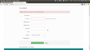
Use default elements
Build your forms with Twitter Bootstrap default like form elements, warnings and buttons.
free psd
On Freepsdfiles.net you can download free psd design. When you look at this example you will see some aspects which not easy fit the bootstrap strategy. First the overlaying phone images. Yes, you could do this in bootstrap too. Using z-indexes and absolute positions. See: example. You will have to adopt all absolute positions for every break point. z-indexes won’t be useful on the small screens without grid. People won’t see the overlaying design effect. And you could wonder if you mobile phone images have any additional value for you mobile visitors at all. Secondly the design had some border effects which don’t fit the grid.

I will wrote about borders and Bootstrap rows in a next post. Of course borders outside the grid can be visible on big screens you still lose them on smaller screens. More horizon design details can be an alternative maybe.
5 columns wide element
One designer offers my the 5 columns wide element shown below.
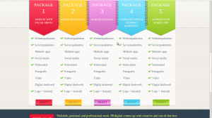
This looks nice in the 960 grid view. What to do on bigger screens? Resize all things will give you big screaming fonts. On the other hand don’t resize will give you a lot of white space. One solution can be the center the columns. Also on smaller screen you can’t use the columns. Putting the columns under each other will give you a long scrolling list with a bad user experience. So you will have to find an other solution for small screens too.