The release candidate 2 of Twitter’s Bootstrap 3 shows some important changes. I decide to write a separate blog for it. Before start reading read first to get an idea of the changes between Twitter’s Bootstrap 3 and Twitter’s Bootstrap 2.
Grid
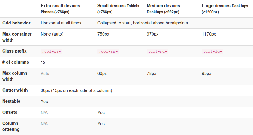
RC2 shows new grid class prefixes: col-xs-* for mobile devices follow by col-sm-* (tablet), col-md-* (laptop) and col-lg-* (desktop). The grid is fluid by default still. Gutter between the columns are replaced with a padding on both sides of the row. See the table below for a total view:
I will show you an example of the use of the grid. Consider this example html:
<div class="container">

<div class="row">

<div class="col-xs-6" style="background-color: pink;">Pink</div>

<div class="col-xs-6" style="background-color: purple;">Purple</div>

</div>

<div class="row">

<div class="col-sm-6" style="background-color: pink;">Pink</div>

<div class="col-sm-6" style="background-color: purple;">Purple</div>

</div>

<div class="row">

<div class="col-sm-6 col-md-4" style="background-color: pink;">Pink</div>

<div class="col-sm-6 col-md-8" style="background-color: purple;">Purple</div>

</div>

<div class="row">

<div class="col-sm-6 col-md-4 col-lg-2" style="background-color: pink;">Pink</div>

<div class="col-sm-6 col-md-8 col-lg-10" style="background-color: purple;">Purple</div>

</div>

</div>
On large desktops (screenwidth >=1200px) this will look like:
Note the `col-lg-10` are applied on the fourth row.
Laptops >= 992px will look like (grid-md-* will be applied on the third and fourth row):
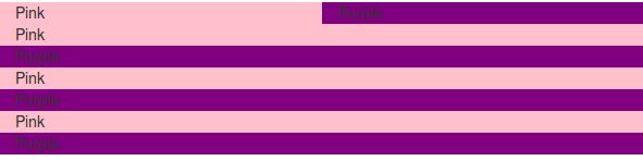
Tabets >= 768px:
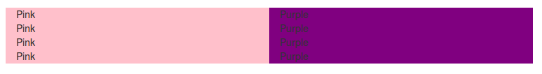 On the first row col-xs-6 has been applied. The next three rows are split with col-sm-6.
<768px:
All rows stack except from the first. The first row got col-xs- for the extra small grid which never stack.
So the col-xs-* will never stack as you see. col-xs-* will always be applied (make the grid horizontal) while the other classes are applied above their breakpoint. Also see the difference between col-xs-* and col-sm-* in the mobile view. Beside the break-points all grids have a max-container size too. To build your templates you could use this default grid, but variations between breakpoints are possible also.
The Jamedo’s Bootstrap Start Theme use a max-container size of 1200 pixels in combination with the Small grid by default. To build a non responsive site TB advice too use the Extra Small Grid with a fixed contianer size, see http://getbootstrap.com/getting-started/#disable-responsive. Read more about non responsive sites with TB3: .
Also realize there is no breakpoint at 480px at the moment. This breakpoint can be used for different views for phones landscape and portrait. See also: Missing the col-ts-* (tiny to small) set of classes?
Althought the gutters are replaced with padding the Less files and the current version of the customizer still define a @grid-gutter-width. This value is used to calculate inner padding of the columns which is @grid-gutter-width/2 = 15 pixels on each side. The margins on the left and the right side of the grid are filled with a negative margin of @grid-gutter-width/2 px too.
Classes for offsets, pull and push are availiable for all grids except the Extra Small grid. The classes have names like .col-sm-offset-* and .col-lg-pull-*.
Other changes in RC2
Glyphicons are back. Twitter’s Bootstrap 3 includes 180 glyphs in font format from the Glyphicon Halflings set. Free of cost and so they ask for a backlink to Glyphicons.com.
Stucture of the navbar has been changed a little. TB3 provide four types of navbars: The default navbar, Static top navbar and fixed navbar top and bottom. See the examples on the Get started page.
Try to check the migration section in the docs to explorer the complete set of changes.
Twitter’s Bootstrap 3 also pays attention to accessibility. They intoduce a new class `sr-only` only visible for screen readers (See: http://a11yproject.com/posts/how-to-hide-content/). You can use it to build links to the main content on the top of your document of navbar like:
<body>
  <a href="#content" class="sr-only">Skip to content</a>
  <div class="container" id="content">
    The main page content.
  </div>
</body>
They also ask your attention for the logical structure of your header elements (<h1> ... <h6>). Default Bootstrap font sizes help you to make your visual (formatted) style consistent with the semantic structure. Screen readers use this semantic stucture to build a table of contents of your document. Consider to not change the font sizes by css but choose the subordinate heading element which fits the semantic structure too. See also: Headings and Subheadings.
New elements elements make it possible to construct b.e. a Listgroup with badges:

Last but not least provides RC2 an example of a Bootstrap Theme constructed in Less: http://getbootstrap.com/examples/theme/
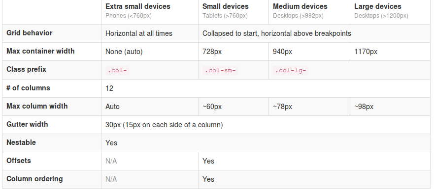
 The most important changes in Twitter Bootstrap 3 will be the more mobile-first approaching and the grid. From now Twitter’s Bootstrap defines three grids: Tiny grid for Phones (<768px), Small grid for Tablets (<992px) and the Medium-large grid for Destkops (>992px). The row class prefixes for these grid are “.col-”, “.col-sm-” and “.col-lg-”. The Medium-large grid will stack below 992 pixels screen width. So does the Small grid below 768 pixels and the tiny grid never stacks. (updated for Twitter’s Bootstrap3 RC1)