Migrate your (former) Skematik theme framework to Twitter’s Bootstrap 3: Instructions for theme developers

At Jamedo Websites we work with the Skematik Theme(work) to build responsive websites. Unfortunately the website was down for a while and Skematik use Twitters Bootstrap 2 only. Cause we need a new version of Skematik i start to migrate it to TB3. You will find this new version on: https://github.com/bassjobsen/jamedo-bootstrap-start-theme.

To use the theme work to build your own child theme use the instruction below:

  1. download from: https://github.com/bassjobsen/jamedo-bootstrap-start-theme/archive/master.zip
  2. copy the content of this .zip to the folder skematik in the wp-content/themes folder (the zip file creates the folder “https://github.com/bassjobsen/jamedo-bootstrap-start-theme/archive/master.zip” you have to rename this to “skematik” )
  3. (search and) replace all “span*” classes in your theme files with “col-lg-*”, see also: http://stackoverflow.com/a/17890898/1596547
  4.  fix all other points (general issues should be send by email to bass@w3masters.nl or send as a pull request to https://github.com/bassjobsen/jamedo-bootstrap-start-theme )

Basic setup for your child themes:

Read: http://codex.wordpress.org/Child_Themes#How_to_Create_a_Child_Theme. So basically create style.css in your child theme folder. Start this file with: @import url("../skematik/style.css");

Learn more about Bootstrap 3

Bootstrap 3 don’t have a separate responsive CSS file any more.

From now Twitter’s Bootstrap defines three grids: Tiny grid for Phones (<480px), Small grid for Tablets (<768px) and the Medium-large grid for Desktops (>768px). The row class prefixes for these grid are “.col-”, “.col-sm-” and “.col-lg-”. The Medium-large grid will stack below 768 pixels screen width. So does the Small grid below 480 pixels and the tiny grid never stacks.

For this reason the “span*” classes in your theme files are replaced with “col-lg-*” in step 3 above. With “col-lg-*” the grid become horizontal above a screen width of 992px (desktop). Below this screen width elements will stack. To start the stacking at 767px use the “col-sm-*” prefixes instead of “.col-lg-”. Read Twitter Bootstrap 3 breakpoints and grid for more information.

Read Bootstrap your (designer’s) mind  also and ask your designer to deliver different designs for screen widths (from low to high). This will help you to choose the right grid settings.

For other changes read: Migrate your templates from Twitter Bootstrap 2.x to Twitter Bootstrap 3 and http://bootply.com/bootstrap-3-migration-guide.

You will find the official documentation of Twitter’s Bootstrap 3 now on: http://getbootstrap.com/.

Compile Twitter’s Bootstrap 3 without responsive features

Bootstrap 3 will be mobile first. No more separate responsive CSS file. Nice, but what if you don’t need / want the responsive features for some reason? So i try to compile Compile Twitter’s Bootstrap 3 without responsive features.

First i made a list of all less files writing media queries:

./print.less:@media print {
./modals.less:@media screen and (min-width: @screen-tablet) {
./carousel.less:@media screen and (min-width: @screen-tablet) {
./responsive-utilities.less:@media screen and (max-width: 400px) {
./responsive-utilities.less:@media (min-width: @screen-tablet) and (max-width: @screen-tablet-max) {
./responsive-utilities.less:@media (min-width: @screen-desktop) {
./responsive-utilities.less:@media print {
./jumbotron.less: @media screen and (min-width: @screen-tablet) {
./grid.less:@media (min-width: @screen-tablet) {
./grid.less:@media (min-width: @screen-desktop) {
./grid.less:@media (min-width: @screen-large-desktop) {
./navbar.less:@media screen and (min-width: @grid-float-breakpoint) {
./mixins.less: @media
./mixins.less: @media (min-width: @screen-small) {
./mixins.less: @media (min-width: @grid-float-breakpoint) {
./forms.less:@media (min-width: 768px) {

The basic idea will be drop the breakpoint and disable all grids except from the 960px (@screen-desktop) one.

I don’t need responsive-utilities.less so i remove it from bootstrap.less. Why does it file contains a “@media print” media query?

// Print utilities
.visible-print {
.responsive-invisibility();
}
.hidden-print { }

@media print {
.visible-print {
.responsive-visibility();
}
.hidden-print {
.responsive-invisibility();
}
}

See also: https://github.com/twitter/bootstrap/issues/8460

I should expect this in print.less, but for this reason i can’t remove responsive-visibility/responsive-invisibility. You will find this functions in mixins.less. (see: )
I also drop jumbotron.less. Why should i need this at all?

After this i look to: “./modals.less:@media screen and (min-width: @screen-tablet)”, “./carousel.less:@media screen and (min-width: @screen-tablet)”, “./navbar.less:@media screen and (min-width: @grid-float-breakpoint)”, “./forms.less:@media (min-width: 768px)”. The hardcoded 768px is a mistake i think, see also: https://github.com/twitter/bootstrap/pull/8454.

@grid-float-breakpoint will defined in variables.less as “@grid-float-breakpoint: @screen-tablet;”. On the first sight i should think this should be: “./modals.less: @media screen and (min-width: @grid-float-breakpoint)”, “./carousel.less:@media screen and (min-width: @grid-float-breakpoint)”, “./navbar.less:@media screen and (min-width: @grid-float-breakpoint)”, “./forms.less:@media (min-width: @grid-float-breakpoint)”. Cause this setting depend on a breakpoint which should be independent of the grid sizes (@screen-tablet). see: https://github.com/twitter/bootstrap/issues/8459

To compile my first non responsive version i have set them all to @grid-float-breakpoint with @grid-float-breakpoint : 0px. This works well for the forms where this breakpoint sets the right alignment for the form labels. Now the alignment is always right which could be okay for a non responsive site. For the dialog the effect will a fixed width of 560 pixels in stead of a 100% (auto) width. For a non responsive site we should prefer this too. Overall it doesn’t matter cause i will replace grid.less and don’t use @screen-tablet any more.

At least i changed grid.less to:


//
// Grid system
// --------------------------------------------------

// Set the container width, and override it for fixed navbars in media queries
.container {
.container-fixed();
}

// Mobile-first defaults
.row {
.make-row();
}

// Common styles for small and large grid columns
.col-1,
.col-2,
.col-3,
.col-4,
.col-5,
.col-6,
.col-7,
.col-8,
.col-9,
.col-10,
.col-11,
.col-12,
{
position: relative;
// Prevent columns from collapsing when empty
min-height: 1px;
// Inner gutter via padding
padding-left: (@grid-gutter-width / 2);
padding-right: (@grid-gutter-width / 2);
}

//
// Container and grid column sizing
//

// Tiny device columns (smartphones)
.col-1,
.col-2,
.col-3,
.col-4,
.col-5,
.col-6,
.col-7,
.col-8,
.col-9,
.col-10,
.col-11,
.col-12 {
float: left;
}
.col-1 { width: percentage((1 / @grid-columns)); }
.col-2 { width: percentage((2 / @grid-columns)); }
.col-3 { width: percentage((3 / @grid-columns)); }
.col-4 { width: percentage((4 / @grid-columns)); }
.col-5 { width: percentage((5 / @grid-columns)); }
.col-6 { width: percentage((6 / @grid-columns)); }
.col-7 { width: percentage((7 / @grid-columns)); }
.col-8 { width: percentage((8 / @grid-columns)); }
.col-9 { width: percentage((9 / @grid-columns)); }
.col-10 { width: percentage((10/ @grid-columns)); }
.col-11 { width: percentage((11/ @grid-columns)); }
.col-12 { width: 100%; }

// Push and pull columns for source order changes
.col-push-1 { left: percentage((1 / @grid-columns)); }
.col-push-2 { left: percentage((2 / @grid-columns)); }
.col-push-3 { left: percentage((3 / @grid-columns)); }
.col-push-4 { left: percentage((4 / @grid-columns)); }
.col-push-5 { left: percentage((5 / @grid-columns)); }
.col-push-6 { left: percentage((6 / @grid-columns)); }
.col-push-7 { left: percentage((7 / @grid-columns)); }
.col-push-8 { left: percentage((8 / @grid-columns)); }
.col-push-9 { left: percentage((9 / @grid-columns)); }
.col-push-10 { left: percentage((10/ @grid-columns)); }
.col-push-11 { left: percentage((11/ @grid-columns)); }

.col-pull-1 { right: percentage((1 / @grid-columns)); }
.col-pull-2 { right: percentage((2 / @grid-columns)); }
.col-pull-3 { right: percentage((3 / @grid-columns)); }
.col-pull-4 { right: percentage((4 / @grid-columns)); }
.col-pull-5 { right: percentage((5 / @grid-columns)); }
.col-pull-6 { right: percentage((6 / @grid-columns)); }
.col-pull-7 { right: percentage((7 / @grid-columns)); }
.col-pull-8 { right: percentage((8 / @grid-columns)); }
.col-pull-9 { right: percentage((9 / @grid-columns)); }
.col-pull-10 { right: percentage((10/ @grid-columns)); }
.col-pull-11 { right: percentage((11/ @grid-columns)); }

// Offsets
.col-offset-1 { margin-left: percentage((1 / @grid-columns)); }
.col-offset-2 { margin-left: percentage((2 / @grid-columns)); }
.col-offset-3 { margin-left: percentage((3 / @grid-columns)); }
.col-offset-4 { margin-left: percentage((4 / @grid-columns)); }
.col-offset-5 { margin-left: percentage((5 / @grid-columns)); }
.col-offset-6 { margin-left: percentage((6 / @grid-columns)); }
.col-offset-7 { margin-left: percentage((7 / @grid-columns)); }
.col-offset-8 { margin-left: percentage((8 / @grid-columns)); }
.col-offset-9 { margin-left: percentage((9 / @grid-columns)); }
.col-offset-10 { margin-left: percentage((10/ @grid-columns)); }
.col-offset-11 { margin-left: percentage((11/ @grid-columns)); }

.container {
max-width: @container-desktop;
}


Now you will have a non responsive grid. Remember use “.col-” as class prefix for your grid rows now. Try it yourself and download the css file from: https://github.com/bassjobsen/non-responsive-tb3

Custom button colors in Twitter’s Bootstrap 3

Twitter’s Bootstrap 3 also delivers 6 button colors. Define your own button colors will a lot simpler as in Twitter’s Bootstrap 2. Cause TB3 drops support for IE7 the button css becomes more straight forward. Every button color still got 3 variants (default, active and disable). For the active state an background and border color are calculated based on the base color. The disable state use the base color and only adds a css-opacity.

TB3 not only drops IE7 support. Twitter’s Bootstrap 3 buttons don’t have a gradient. Also the text-shadow is removed.

I create a new Twitter Bootstrap Button Generator. Use this generator for Twitter’s Boostrap 3.x. Input a html color gives you the css code for your buttons. Add the css in your html after the Bootstrap’s CSS inclusion.

You got 2 choses of buttons. The default simple css and the more complex ‘old style’ css with added gradient. This new generator use Lessphp to generate the css code. Lessphp is a compiler for LESS written in PHP. See also: Twitter bootstrap buttons

Migrate your templates from Twitter Bootstrap 2.x to Twitter Bootstrap 3

NB the text below has been written with Twitter’s Bootstrap 3 RC1 in mind. RC2 show important changes, so also read:

Twitter Bootstrap 3Major points for migration:

  1. reconsider your base templates
  2. rename your grid classes
  3. if you templates don’t use the fluid layout, check nesting rows
  4. check and reconsider the stacking of elements in the new mobile grid

Base templates

Twitter Bootstrap 3 drops support for IE7 and Firefox 3.x. Following this you don’t need to include html5shiv any more. Including respond.js (not included) will be enough for CSS media querie support in IE8. For Twitter Bootstrap 2.x i used initializr.com to create a base template. For Twitter Bootstrap 3 you can consider to use a minimalistic template as base:

<!DOCTYPE html>
<html>
<head>
<title>Bootstrap 101 Template</title>
<meta name=”viewport” content=”width=device-width, initial-scale=1.0″>
<!– Bootstrap –>
<link href=”css/bootstrap.min.css” rel=”stylesheet” media=”screen”>
</head>
<body>
<h1>Hello, world!</h1>

<!– JavaScript plugins (requires jQuery) –>
<script src=”http://code.jquery.com/jquery.js”></script>
<!– Include all compiled plugins (below), or include individual files as needed –>
<script src=”js/bootstrap.min.js”></script>

<!– Optionally enable responsive features in IE8 –>
<script src=”js/respond.js”></script>
</body>
</html>

This template will be responsive mobile first by default.

Rename your grid classes

The grid classes for span and offset are renamed form span* and offset* to col-span-* and col-offset-* in Twitter Bootstrap 3. Preform a global search and replace action in your templates files to rename this classes. You could use regular expressions to do this. I use Geany to edit my templates files. Regular expressions like replace “span([0-8]+)” with “col-span-\1” did the trick, see below:
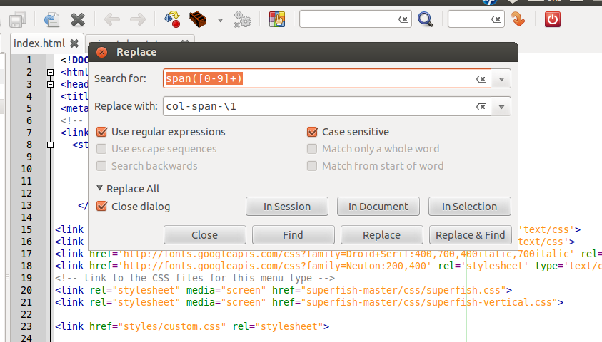
regular expression
From now Twitter’s Bootstrap defines three grids: Tiny grid for Phones (<480px), Small grid for Tablets (<768px) and the Medium-large grid for Destkops (>768px). The row class prefixes for these grid are “.col-“, “.col-sm-” and “.col-lg-“. The Medium-large grid will stack below 768 pixels screen width. So does the Small grid below 480 pixels and the tiny grid never stacks.Twitter’s Bootstrap 3 defines three grids: Tiny grid for Phones (<768px), Small grid for Tablets (>768px) and the Medium-Large grid for Destkops (>992px). The row class prefixes for these grid are “.col-”, “.col-sm-” and “.col-lg-”. The Medium-large grid will stack below 992 pixels screen width. So does the Small grid below 768 pixels and the tiny grid never stacks. Except for old phones which always will stack the elements (mobile first design). (last update about the grid based on Twitter’s Bootstrap 3 RC1, see also: Twitter’s Bootstrap 3 grid, changing breakpoint and removing padding)

See also http://examples.getbootstrap.com/grid/ for more examples of the grids. Or consider the table below:
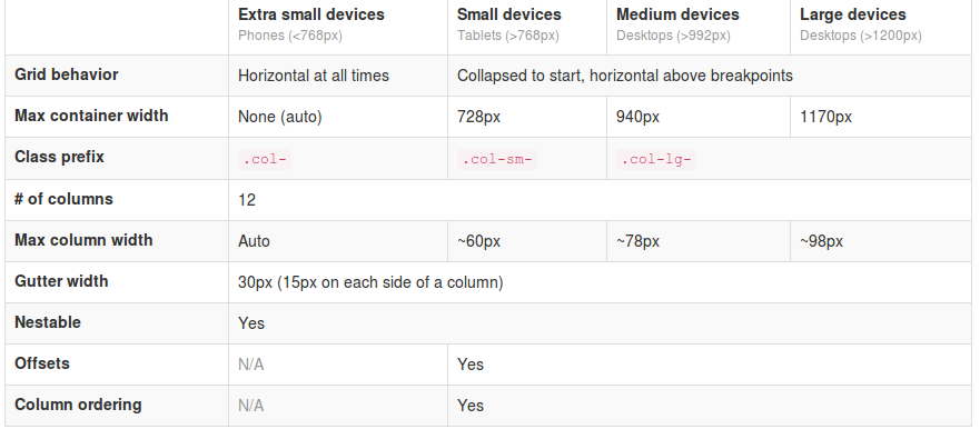
Twitter's Boostrap 3 Grid

Use Less mixins to migrate your grid

The ‘old’ span* will not be the same as col-* or col-lg-*. So replacing the class names in your templates will be give you better results. But when looking to an example like http://examples.getbootstrap.com/jumbotron/index.html you will find the the col-lg-* class in place of the former span* class. This will give you a possibility to create a mixin for span* with the same styles as col-lg-* in this case. Note: The col-lg-* will stack below 992px by default (see: New twitter bootstrap 3 grid, changing breakpoint and removing padding).

Switch to fluid layout

A fluid layout uses percents instead of pixels for column widths. Twitter Bootstrap 2.x let you choose between pixels and percents. In Twitter Bootstrap 3 the grid is fluid by default. So if you didn’t use the fluid grid it’s time to switch now. The most important difference will be the nesting of row. Using percents a nested row should get a total width of 100% too cause it gets its width from its parent. For this reason each nested level of columns should add up to 12 columns in the fluid layout. Who don’t use the fluid layout in Twitter Bootstrap 2.x will used to give a nested row a set of columns that add up to the number of columns of its parent. So find your nested rows and change their columns so their number add up to 12.

The small and tiny grid

In Twitter Bootstrap 3 anything under 768px use the so called small device grid. The small and tiny device grid also have 12 columns and are fluid too. Offsets are not available and you have to use special classes to set the columns. Use the .col-* and .col-sm-* classes for the mobilethese grids.
You can use all grid classes for the same column b.e.:

<div class=”col-span-3 col-small-span-6″>

<div class=”col-6 col-sm-6 col-lg-6″>

The above will give you a column of 50% width in the large grid, but a column of 50% in the smaller grids too. So .col-* and col-sm-* will help you to set the way of stacking the columns on small devices. The col-lg-* classes are never applied on the small grids. Without adding col-6 and col-sm-6 a div with col-lg-6 get 100% width on the small device grids. see: http://www.bootply.com/67209

Also read: Writing Twitter’s Bootstrap with upgrading to v3 in mind

Example

I migrate my free demo webshop template to TB3. After doing the steps above there still will be other thing to fix.

Responsive navbar

In these templates the menu is wrapped in a “Responsive navbar”. Also here class names are changed. The most important change here is the toggle button is now a real <button> with class .navbar-toggle. The .navbar class adds a background color now.
I change the <a> of the toggle button to button and add the .navbar-toggle class. I also add “.navbar {background:none}” to my custom stylesheets. Now the menu works and collapses as before, beside the collapsing point is at 728 pixels now in stead of 940 pixels.

Padding instead of margin

In the templates i wrapped the product boxes in columns of a row. After the migration this don’t fit any more.

In the in change log we could read: “New single grid system (still uses .row) utilizes percentages over pixels, padding instead of margin, and box-sizing: border-box for easy math.”. Each column now got b.e. padding-left: 15px and padding-right: 15px instead of margin-left: 30px;
In the template i add an extra div. This div got my custom classes and will be the parent of the product info code.

<div class=”span3 productitem allround”><div class=”productitemimage”> changed to <div class=”col-4″><div class=”productitem allround”><div class=”productitemimage”>

Input-append class

Before i create the search box with the input-append class. With Twitter Bootstrap 3 you should use the input-group class together with a input-group-btn class:

<div class=”input-group col-4″>
<input type=”text”>
<span class=”input-group-btn”>
<button class=”btn btn-search” type=”button”>Search</button>
</span>
</div>

Breadcrumbs

Twitter Bootstrap 3 adds a separator (/) automatic. You don’t need to code the separator yourself and you have to remove the <span class=”divider”>/</span> from your code. The separator is a slash with color gainsboro (#CCCCCC) by default. You could add “.breadcrumb > li:after” to your custom css to change the separator char or its color.
.breadcrumb > li:after {color:#FF0000; content: ” >”;}

Pagination

The pagination class needs to add to the ul-tag direct instead of to the containing div. But when you want to center the pagination you will have add the center class to the containing div. Note Pager links (previous / next) are centered by default.

Download

You can download this Free Twitter Bootstrap 3 template on Github. Test your own templates on http://bootply.com/ now.

Glyphicons

With the launch of Bootstrap 3, icons have been moved to a separate repository.

Responsive images

Twitter’s Bootstrap 2 makes images responsive by default (by adding max-weight:100%). Bootstrap 3 has a special class to make your images responsive. Use `class=”img-responsive”` to make your images responsive now. See also: Images not responsive by default in Twitter Bootstrap 3.0 RC1?

WordPress Bootstrap 3 Start Theme

I start to migrate the former Skematik theme to Bootstrap 3. This powerful theme framework that can be used as a standalone website builder or as a framework to create child themes for WordPress build on Twitter’s Bootstrap 3. Please give it a try: https://github.com/bassjobsen/jamedo-bootstrap-start-theme. Contributions are welcome 🙂

Migrators

Other useful links:

The migration section in the docs,
Migration Guide, PHP class for migration and Bootstrap migration tools in progress: https://github.com/iatek/bootstrap-migrate

Migrate your Javascript Plugins

Many people wrote Javascript Plugins for Twitter’s Boostrap 2.x. Some examples: Bootstrap-datepicker and Jasny Bootstrap. Most plugins can migrate to TB3 easily, see: How to migrate your Twitter’s Bootstrap Javascript plugins from version 2.x to version 3

Twitter Bootstrap 3 breakpoints and grid

Release Candidate 2 has important changes for the grid and the grid classes. Read Twitter’s Bootstrap 3 RC2 (important changes)

Twitter Bootstrap 3The most important changes in Twitter Bootstrap 3 will be the more mobile-first approaching and the grid. From now Twitter’s Bootstrap defines three grids: Tiny grid for Phones (<768px), Small grid for Tablets (<992px) and the Medium-large grid for Destkops (>992px). The row class prefixes for these grid are “.col-”, “.col-sm-” and “.col-lg-”. The Medium-large grid will stack below 992 pixels screen width. So does the Small grid below 768 pixels and the tiny grid never stacks. (updated for Twitter’s Bootstrap3 RC1)

Twitter’s Bootstrap 2 defines breakpoints at 480px, 768px, 980px and 1200px. The layout will always be fluid below 768px.

For this reason the ‘old’ span* will not be the same as col-* or col-lg-*. So replacing the class names in your templates will be give you better results. But when looking to an example like http://examples.getbootstrap.com/jumbotron/index.html you will find the the col-lg-* class in place of the former span* class.

Twitter's Bootstrap 3 Grid

Breakpoints

In variables.less you will find:

// Media queries breakpoints
// --------------------------------------------------

// Extra small screen / phone
@screen-xsmall:              480px;
@screen-phone:               @screen-xsmall;

// Small screen / tablet
@screen-small:               768px;
@screen-tablet:              @screen-small;

// Medium screen / desktop
@screen-medium:              992px;
@screen-desktop:             @screen-medium;

// Large screen / wide desktop
@screen-large:               1200px;
@screen-large-desktop:       @screen-large;

// So media queries don't overlap when required, provide a maximum
@screen-small-max:           (@screen-medium - 1);
@screen-tablet-max:          (@screen-desktop - 1);
@screen-desktop-max:         (@screen-large-desktop - 1);

// Grid system
// --------------------------------------------------

// Number of columns in the grid system
@grid-columns:              12;
// Padding, to be divided by two and applied to the left and right of all columns
@grid-gutter-width:         30px;
// Point at which the navbar stops collapsing
@grid-float-breakpoint:     @screen-tablet;

When i test this values if found something different:

  • “col-*” will be applied always (never stacks)
  • “col-sm-*” will be applied between 768 and higher (992px) (stacks at 767)
  • “col-lg-*” will be applied between 992 and higher (stacks at 991)

NOTE: @screen-small is not in use at the moment.

See also http://examples.getbootstrap.com/grid/ for more examples of the grids.

The grid of Twitter Bootstrap 3 has been change to fluid by default. Twitter Bootstrap 3 has only one breakpoint. We will find this breakpoint at 768 pixels. This breakpoint splits small screens and large screens.

Both sides of the breakpoint have a 12 column wide grid. Only modern phone will use the mobile grid, older phoned should only stack. Class names for span and offset are change to col-span-* and -*. Also Twitter Bootstrap 3 introduce new classes (col-small-span-*) for stacking in the mobile grid. You will use this new classes in combination with the standard span and offset classes for large devices:

Imagine you will add two image next to each other in a row.

Twitter Bootstrap 2: (old situation)

<div class=”row”>
<div class=”span6″><img src=”image1.png”></div>
</div>

On small screens the images will stack with a 100% width in a fluid layout.

Twitter bootstrap 3:

<div class=”row”>
<div class=”col-span-6″><img src=”image1.png”></div>
</div>

Without adding the mobile classes the images will don’t use the mobile grid and stack with 100% width.
(Note this differs from my expectation. I expected the main classes also should influence the mobile grid.)

no grid

Now we could add the new classes and let the images show next to each other with 50% width:

<div class=”row”>
<div class=”col-span-6 col-small-span-6″><img src=”image1.png”></div>
</div>

grid

You can also use this class to change the way of stacking:

<div class=”row”>
<div class=”col-span-4 col-small-span-12″><img src=”image1.png”></div>
<div class=”col-span-4 col-small-span-6″><img src=”image1.png”></div>
</div>

So we lost some breakpoints but got a small device grid back. Remember offsets are not available with the small grid. Two other new classes are col-pull-* and col-push-*. This classes help you to change the order of your columns. Also these classes are not available with the small grid.

Large screens

The new fluid grid without a default width also lets me think about large screens again. Should i made a decision about the max width of my site when viewed on a large screen? Users who use a site on an large screen with a full screen browsers window should have a reason to do so. So it seems to be more user friendly to let the user choose the max width. I found an interesting article about this: Life Beyond 960px: Designing for Large Screens. At the moment the .container class provides max-widths (728px, 940px en 1170px) for the large grid.

Explore and install Twitter Bootstrap 3

Twitter Bootstrap 3Release Candidate 1 of Twitter’s Bootstrap 3 has been released now. With RC1 Bootstrap uses Grunt to compile the files (see at the end of this post) Twitter Bootstrap 3 is not ready for production yet. At this time you can download the latest version on GitHub.
To build and compile this version you need to install: node, npm, less, jshint recess, uglify-js and make. I build on Ubuntu 12.04 LTS.

        Download:

https://github.com/twitter/bootstrap/archive/3.0.0-wip.zip

        Install node (

https://github.com/joyent/node/wiki/Installing-Node.js-via-package-manager

        )
        Install npm (apt-get install npm)
        Install less (npm install -g less)

Install jshint (npm install -g jshint, use npm install jshint recess uglify-js -g)install jshint, recess and uglify-js (install npm)

        run

make build

      to compile Bootstrap

When i tried to build Bootstrap the first time, i got an error like “Error: No compatible version found: source-map@’>=0.1.7- <0.2.0-‘” I solved this by adding Chris Lea’s PPA (https://launchpad.net/~chris-lea/ archive/node.js/) to my system. After updating node.js i still got some errors (js/bootstrap-affix.js: line 23, col 17, Bad option: ‘;_;’. etc.) when building. Running ‘npm install‘ after updating solved this.
After reading npm 1.0: Global vs Local installation and take a better look at the Makefile i realize Running ‘npm install‘ installs local versions of jshint, recess, uglify-js in “./node_modules/.bin”. Where v2.3.1 requires a local install v3 also looks in the global path.

Documentation

To view the docs locally, you’ll need to install Jekyll to run a local server. Run Jekyll from the “docs” dir; jekyll –server. Docs will be available on http://localhost:{port}/docs.html where {port} is 9001 by default. See also: Compile bootstrap 3 docs (How to)?
Twitter Bootstrap 3 Docs


Grunt

With RC1 Bootstrap uses Grunt with convenient methods for working with the framework.

  1. Install `grunt-cli` globally with `npm install -g grunt-cli`.
  2. Install the [necessary local dependencies](package.json) via `npm install`
  3. use `grunt` to compile and run tests or `grunt dist` to only compile CSS and Javascript


Compiled CSS and JS

Try twitter Bootstrap 3 without compiling and building it? Download the compiled and minified versions of the CSS, JavaScript, and fonts here. No documentation or original source files are included. Updated to RC1


Bootply

Bootply is a playground for Twitter Bootstrap. Use Bootply to design, prototype, extend, or test the Bootstrap framework. Bootply also offers you the opportunity to test your code with Twitter Bootstrap 3.0.0 RC now.


CDN

The folks over at NetDNA have graciously provided CDN support for Bootstrap’s CSS and JavaScript. To use, swap your local instances for the Bootstrap CDN links listed below.


<!-- Latest compiled and minified CSS -->
<link href="//netdna.bootstrapcdn.com/bootstrap/3.0.0-rc1/css/bootstrap.min.css" rel="stylesheet" />

<!-- Latest compiled and minified JavaScript -->
<script type="text/javascript" src="//netdna.bootstrapcdn.com/bootstrap/3.0.0-rc1/js/bootstrap.min.js"></script>