 Release Candidate 1 of Twitter’s Bootstrap 3 has been released now. With RC1 Bootstrap uses Grunt to compile the files (see at the end of this post)
 Twitter Bootstrap 3 is not ready for production yet. At this time you can download the latest version on GitHub.
To build and compile this version you need to install: node, npm, less, jshint recess, uglify-js and make. I build on Ubuntu 12.04 LTS.
- Download:
https://github.com/twitter/bootstrap/archive/3.0.0-wip.zip
- Install node (
https://github.com/joyent/node/wiki/Installing-Node.js-via-package-manager
- )
- Install npm (apt-get install npm)
- Install less (npm install -g less)
Install jshint (npm install -g jshint, use npm install jshint recess uglify-js -g)install jshint, recess and uglify-js (install npm)
- run
make build
- to compile Bootstrap
When i tried to build Bootstrap the first time, i got an error like “Error: No compatible version found: source-map@’>=0.1.7- <0.2.0-‘” I solved this by adding Chris Lea’s PPA (https://launchpad.net/~chris-lea/ archive/node.js/) to my system. After updating node.js i still got some errors (js/bootstrap-affix.js: line 23, col 17, Bad option: ‘;_;’. etc.) when building. Running ‘npm install‘ after updating solved this.
After reading npm 1.0: Global vs Local installation and take a better look at the Makefile i realize Running ‘npm install‘ installs local versions of jshint, recess, uglify-js in “./node_modules/.bin”. Where v2.3.1 requires a local install v3 also looks in the global path.
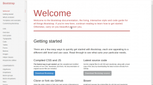
Documentation
To view the docs locally, you’ll need to install Jekyll to run a local server. Run Jekyll from the “docs” dir; jekyll –server. Docs will be available on http://localhost:{port}/docs.html where {port} is 9001 by default. See also: Compile bootstrap 3 docs (How to)?
Grunt
With RC1 Bootstrap uses Grunt with convenient methods for working with the framework.
- Install `grunt-cli` globally with `npm install -g grunt-cli`.
- Install the [necessary local dependencies](package.json) via `npm install`
- use `grunt` to compile and run tests or `grunt dist` to only compile CSS and Javascript
Compiled CSS and JS
Try twitter Bootstrap 3 without compiling and building it? Download the compiled and minified versions of the CSS, JavaScript, and fonts here. No documentation or original source files are included. Updated to RC1
Bootply
Bootply is a playground for Twitter Bootstrap. Use Bootply to design, prototype, extend, or test the Bootstrap framework. Bootply also offers you the opportunity to test your code with Twitter Bootstrap 3.0.0 RC now.
CDN
The folks over at NetDNA have graciously provided CDN support for Bootstrap’s CSS and JavaScript. To use, swap your local instances for the Bootstrap CDN links listed below.
<!-- Latest compiled and minified CSS -->

<link href="//netdna.bootstrapcdn.com/bootstrap/3.0.0-rc1/css/bootstrap.min.css" rel="stylesheet" />
<!-- Latest compiled and minified JavaScript -->
<script type="text/javascript" src="//netdna.bootstrapcdn.com/bootstrap/3.0.0-rc1/js/bootstrap.min.js"></script>
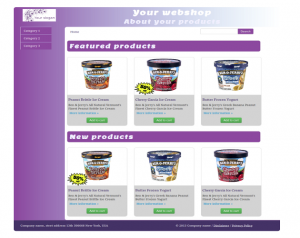
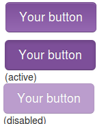
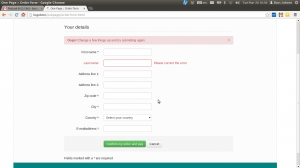
 Twitter Bootstrap is a front-end toolkit for rapidly developing web applications and websites. It is a collection of CSS and HTML conventions. Twitter Bootstrap is built on LESS. LESS extends CSS with dynamic behavior such as variables, mixins, operations and functions. At the moment i build most website and webapplications with Twitter Bootstrap. Examples