Bootstrap 4’s responsive navbars

Bootstrap 4 is in development. The alpha 3 stage had been reached yet. The new navbar is a simple wrapper for positioning branding, navigation, and other elements into a concise navigation header.

Many people has started testing Bootstrap 4 already. Before you start you should know that i did NOT switch from Less to Sass, but Bootstrap did. The CSS code of Bootstrap 4 is built with Sass now. Those who are no familiar with Sass yet should definitely read my new Sass and Compass Designer’s Cookbook book.

You can use Bootstrap CLI to test Bootstrap 4. Many templates are available yet. Bootstrap CLI is suitable for fast prototyping too!

At the time of writing this blog the code for the responsive navbar is not finished yet. I will provide you some quick fixes which enable you to use the responsive navbar in your new Bootstrap 4 projects. Notice that you should not use any alpha code for production.

The HTML code for a responsive navbar may look like that shown beneath:

<nav class="navbar navbar-dark navbar-full" role="navigation">
<div class="container">
<a class="navbar-brand" href="index.html">Navbar</a>
<button class="navbar-toggler hidden-md-up pull-xs-right" type="button" data-toggle="collapse" data-target="#collapsiblecontent">
&#9776;
</button>
<ul class="nav navbar-nav navbar-toggleable-sm collapse" id="collapsiblecontent">
<li class="nav-item">
<a class="nav-link active" href="#">Home <span class="sr-only">(current)</span></a>
</li>
<li class="nav-item">
<a class="nav-link" href="#">Features</a>
</li>
<li class="nav-item">
<a class="nav-link" href="#">Pricing</a>
</li>
<li class="nav-item">
<a class="nav-link" href="#">About</a>
</li>
</ul>
</div>
</nav>

Notice the hidden-md-up and navbar-toggleable-sm classes. The hidden-md-up class ensure that the “hamburger” menu to toggle the collapsing of the menu is only visible on the small viewports (the xs and sm grids). The navbar-toggleable-sm class collapses the menu and make it toggleable on the the xs and sm grids. The responsive navbar requires Bootstrap’s JavaScript Collapse plugin. When your navbar contains dropdowns, as explained later on, the Dropdown Plugin is required too.

Till the alpha-3 release of Bootstrap 4 the menu items do not stack for the collapsed menu. You can fix this by using the following SCSS code and recompile Bootstrap:

.navbar {
@include media-breakpoint-down(sm) {
.navbar-brand,
.nav-item {
float: none;
}
}
}

Now your menu items stack, but all nav items except from the first one got a margin-left. Fix the margin by editing the following SCSS code:

.navbar {
@include media-breakpoint-down(sm) {
.nav-item + .nav-item {
margin-left: 0;
}
}
}

Both solutions provide above use the media-breakpoint-down() mixin. Setting the @media with a max-width afterward will break the mobile first nature of Bootstrap 4, but for now these quick fixes will help you to test and protype with Bootstrap before the final version is released.

Dropdown menus in the navbar of Bootstrap 4

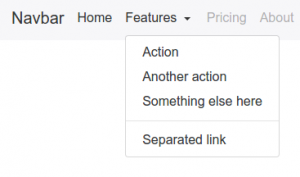
Bootstrap’s Dropdown Plugin enable you to create dropdown menus with ease. You can also add these dropdown menus in your navbar as follows:

<ul class="nav navbar-nav navbar-toggleable-sm collapse" id="collapsiblecontent">
<li class="nav-item">
<a class="nav-link active" href="#">Home <span class="sr-only">(current)</span></a>
</li>
<li class="nav-item dropdown">
<a class="nav-link dropdown-toggle" data-toggle="dropdown" href="#" role="button" aria-haspopup="true" aria-expanded="false">
Features
</a>
<div class="dropdown-menu">
<a class="dropdown-item" href="#">Action</a>
<a class="dropdown-item" href="#">Another action</a>
<a class="dropdown-item" href="#">Something else here</a>
<div class="dropdown-divider"></div>
<a class="dropdown-item" href="#">Separated link</a>
</div>
</li>
</ul>

When expecting the results in your browser you’ll find that the second menu item got a awesome dropdown menu:

Dropdown menu on the large grid

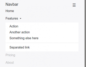
For screens smaller than the responsive breakpoint (768px) the dropdown menu should act like a normal nested ul element. Again Sass will save us. You can use the the following SCSS code to turn the dropdown menu into a nested collapsing element of list of nav items:

@include media-breakpoint-down(sm) {
.navbar {

.nav-item + .nav-item {
margin-left: 0;
}

.dropdown {
position: initial;
}

.dropdown-menu {
position: initial;
z-index: initial;
float: initial;
border: initial;
border-radius: initial;
}
}
}

On the small viewports the dropdown menu will now look like that shown in the figure below:

Dropdown menu in the small grid

You can use Bootstrap CLI to test the responsive Bootstrap 4 navbar with dropdown menus:

[sudo] npm install -g gulp bower
npm install bootstrap-cli --global

And use the following command to set up the responsive Bootstrap 4 navbar with dropdown menus example:

bootstrap new --template responsive-navbar-dropdowns

Justified navbar items

Bootstrap 4 removes the option to justify your navbar items. You can justify your navbar items in Bootstrap 4 by using the nav-justified mixin:

// Justified nav links
// -------------------------

@mixin nav-justified($breakpoint: md) {
width: 100%;

.nav-item {
float: none;
}

.nav-link {
text-align: center;
margin-bottom: 5px;
}

> .dropdown .dropdown-menu { //todo: remove child selector
top: auto;
left: auto;
}

@include media-breakpoint-up($breakpoint) {
.nav-item {
display: table-cell;
width: 1%;
}
.nav-link {
margin-bottom: 0;
}
}
}

Use the following SCSS code to use the nav-justified mixin above:

.navbar {
@include nav-justified;
}

Recompile Bootstrap and you’ll find that your navbar will look like that shown in the figure below:

Bootstrap 4 Justified navbar items


You can test the Justified navbar items for Bootstrap 4 with Bootstrap CLI again:

bootstrap new --template nav-justified

Centered navbar items

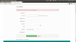
To center a ul element inside a div element you’ll have to set text-align: center (you can use the predefined text-xs-center class of Bootstrap for that) and display: inline-block; for your centered list.

Your HTML code:

<nav class="navbar navbar-light main-nav">
<div class="container text-xs-center">
<ul class="nav navbar-nav pull-xs-left">
<li class="nav-item active">
<a class="nav-link" href="#">Home</a>
</li>
<li class="nav-item">
<a class="nav-link" href="#">Download</a>
</li>
<li class="nav-item">
<a class="nav-link" href="#">Register</a>
</li>
</ul>

<ul class="nav navbar-nav" style="display: inline-block;">
<li class="nav-item"><a class="nav-link" href="#">Website Name</a></li>
</ul>

<ul class="nav navbar-nav pull-xs-right">
<li class="nav-item">
<a class="nav-link" href="#">Rates</a>
</li>
<li class="nav-item">
<a class="nav-link" href="#">Help</a>
</li>
<li class="nav-item">
<a class="nav-link" href="#">Contact</a>
</li>
</ul>
</div>
</nav>

The results:

Bootstrap 4 Centered Navbar Item

Less for the Ionic framework

This week I started to build a Less version for the Ionic framework. The Ionic framework, or shortly Ionic is a beautiful, open source front-end SDK for developing hybrid mobile apps with HTML5.

Why should you need a Less version when there’s already a SASS version? Well, I know that Less vs SASS had been discussed a thousands times. Personally i like Less because of its syntax stays as close as possible to the declarative nature of CSS. But i also really believe that Less is more suitable than SASS for CSS framework like Ionic because of its lazy loading nature. Lazy loading and apply the last declaration wins rule, which means that you can easily override any variable by putting the definition afterwards.

The example from the official Less documentation shows you what the preceding exactly means:

// library
@base-color: green;
@dark-color: darken(@base-color, 10%);

// use of library
@import “library.less”;
@base-color: red;

Secondly having a Less version will enable me to write a Less plugin for Ionic. This plugin imports the library before your custom code, without the need to explicit import it in your code. After installing the plugin you can simply compile your code with the following command:

lessc apllication.less application.css –ionic

Read now the Formula which describe how to deploy Ionic apps with Less: Customize your Ionic app’s theme with Less. This Formula uses the Less autoprefix plugin and the Less ionic plugin.

Migrate Ionic from SASS to Less

I decide to do the migration in 3 steps:

  1. First rewrite the basic system in Less; reset, scaffolding, type and grid (also ionicons cause they’ve got a Less version already)
  2. Include the autoprefix plugin in the build chain
  3. Rewrite other code, including components

About the autoprefixer

I found that many the purpose of many of the current mixins in Ionic is only adding CSS vendor prefixers. The / a autoprefix postprocessor can add these vendor prefixers automatically. Since version 2 of Less you can also use the Less autoprefix plugin of this task. Alternatively you can use gulp-autoprefix in the build chain too. Also notice there is no reason to not use the autoprefixer with SASS too.

How does this works?

The SASS code contains the following mixin:

@mixin align-items($value: stretch) {
@if $value == flex-start {
-webkit-box-align: start;
-ms-flex-align: start;
} @else if $value == flex-end {
-webkit-box-align: end;
-ms-flex-align: end;
} @else {
-webkit-box-align: $value;
-ms-flex-align: $value;
}
-webkit-align-items: $value;
-moz-align-items: $value;
align-items: $value;
}

To do the same in Less, you will need some kind of helper mixin, as can be seen in the following code:

.ms-align-items(@value: stretch) when (@value = flex-start) {
-webkit-box-align: start;
-ms-flex-align: start;
}
.ms-align-items(@value) when (@value = flex-end) {
-webkit-box-align: end;
-ms-flex-align: end;
}
.ms-align-items(@value) when (default()) {
-webkit-box-align: @value;
-ms-flex-align: @value;
}

.align-items(@value) {
.ms-align-items(@value);
-webkit-align-items: @value;
-moz-align-items: @value;
align-items: @value;
}

When using the mixins above:

div.flex-end {
@include align-items(flex-end);
}

or

div.flex-end {
.align-items(flex-end);
}

outputs:

div.flex-end {
-webkit-box-align: end;
-ms-flex-align: end;
-webkit-align-items: flex-end;
-moz-align-items: flex-end;
align-items: flex-end; }

When using the autoprefixer you Less (or SASS) code will look like that shown below to do the same:

div.flex-end {
align-items: flex-end;
}

The following command:

echo “div.flex-end { align-items: flex-end; }” | lessc – –autoprefix

outputs:

div.flex-end {
-webkit-box-align: end;
-webkit-align-items: flex-end;
-ms-flex-align: end;
align-items: flex-end;
}

The preceding look well, but the -moz-align-items: flex-end; declaration is missing. This can be fixed by brute adding prefixes for even the most old browsers by running:

echo “div.flex-end { align-items: flex-end; }” | lessc – –autoprefix=”last 20 versions”

The above indeed adds the -moz-align-items: flex-end; declaration, but it seems nicer to set the supported browser more specific. I could not find which browsers Ionic should support. But i found that it support only browsers with flexbox support. So for now i will use the following command:

echo “div.flex-end { align-items: flex-end; }” | lessc – –autoprefix=”Android >= 2.1,BlackBerry >= 7,Chrome >= 20,Firefox >= 21,Explorer >= 10,iOS >= 3.2,Opera > 12,Safari > 6,OperaMobile >= 12.1,ChromeAndroid >= 40,FirefoxAndroid >= 30,ExplorerMobile >= 10″

Now the above commands outputs as desired:

div.flex-end {
-webkit-box-align: end;
-webkit-align-items: flex-end;
-moz-box-align: end;
-ms-flex-align: end;
align-items: flex-end;
}

When applying all the above the Less gulp task should look like that shown beneath:

gulp.task(‘less’, function(done) {
var LessPluginAutoprefix = require(‘less-plugin-autoprefix’),
autoprefix = new LessPluginAutoprefix({ browsers: [“Android >= 2.1″,”BlackBerry >= 7″,”Chrome >= 20″,”Firefox >= 21″,”Explorer >= 10″,”iOS >= 3.2″,”Opera > 12″,”Safari > 6″,”OperaMobile >= 12.1″,”ChromeAndroid >= 40″,”FirefoxAndroid >= 30″,”ExplorerMobile >= 10”] });

gulp.src(‘less/ionic.less’)
.pipe(header(banner))
.pipe(less({
plugins: [autoprefix],
onError: function(err) {
//If we’re watching, don’t exit on error
if (IS_WATCH) {
console.log(gutil.colors.red(err));
} else {
done(err);
}
}
}))
.pipe(concat(‘ionic.css’))
.pipe(gulp.dest(buildConfig.dist + ‘/css’))
.pipe(gulpif(IS_RELEASE_BUILD, minifyCss()))
.pipe(rename({ extname: ‘.min.css’ }))
.pipe(gulp.dest(buildConfig.dist + ‘/css’))
.on(‘end’, done);
});

Should both SASS and Less code maintained?

As has been mentiond rightly at https://github.com/driftyco/ionic/issues/2252 maintaining two version does not seem teh right way to go. Possible fixes: Bootstrap SASS has been automaticaly created from the Less version and @kristoferjoseph from flexboxgrid.com suggests to build a CLI /JavaScript process that ouputs code for different preprocessors.


update

Autoprefixing:

The .touch-callout(none); mixin add only the -webkit-touch-callout: @value;. The autoprefixer does not efficient solve the preceding. When we code touch-callout: none; the -webkit- is not add (and the unprefixed property is not removed). On the other hand it is not sure if the right prefixes are addded in future, when we code -webkit-touch-callout: @value;. The .touch-callout(none); mixins in not removed for now.

I also found a difference for the order property.

When coding order: 3 the original mixin outputs:

-webkit-box-ordinal-group: 3;
-webkit-order: 3;
-moz-box-ordinal-group: 3;
-ms-flex-order: 3;
order: 3;

The autoprefixer outputs in this situation:

-webkit-box-ordinal-group: 4;
-webkit-order: 3;
-moz-box-ordinal-group: 4;
-ms-flex-order: 3;
order: 3;

Although i could not find any documentation that suggest to increase the value of the *-box-ordinal-group, the incrementation could make sense cause the initial value of *-box-ordinal-group property is 1 whilst the order property has got an initial value of 0.

The -webkit-font-smoothing property is only be used by Webkit browsers. Because of -webkit-font-smoothing has no official syntax, this property is also not supported by the autoprefixer. There is no reason to expect that other browser will start using this property in future. Also the original mixin seems to be incorrect because of the font-smoothing property does not exist:

.font-smoothing(@font-smoothing) {
-webkit-font-smoothing: @font-smoothing;
font-smoothing: @font-smoothing;
}

The mixin has been removed from the Less code in favor of coding -webkit-font-smoothing directly. The same seem true for the .touch-callout(none); mixin hindsight. Also the .touch-callout(none); mixin has been removed.

Migrate your (former) Skematik theme framework to Twitter’s Bootstrap 3: Instructions for theme developers

At Jamedo Websites we work with the Skematik Theme(work) to build responsive websites. Unfortunately the website was down for a while and Skematik use Twitters Bootstrap 2 only. Cause we need a new version of Skematik i start to migrate it to TB3. You will find this new version on: https://github.com/bassjobsen/jamedo-bootstrap-start-theme.

To use the theme work to build your own child theme use the instruction below:

  1. download from: https://github.com/bassjobsen/jamedo-bootstrap-start-theme/archive/master.zip
  2. copy the content of this .zip to the folder skematik in the wp-content/themes folder (the zip file creates the folder “https://github.com/bassjobsen/jamedo-bootstrap-start-theme/archive/master.zip” you have to rename this to “skematik” )
  3. (search and) replace all “span*” classes in your theme files with “col-lg-*”, see also: http://stackoverflow.com/a/17890898/1596547
  4.  fix all other points (general issues should be send by email to bass@w3masters.nl or send as a pull request to https://github.com/bassjobsen/jamedo-bootstrap-start-theme )

Basic setup for your child themes:

Read: http://codex.wordpress.org/Child_Themes#How_to_Create_a_Child_Theme. So basically create style.css in your child theme folder. Start this file with: @import url("../skematik/style.css");

Learn more about Bootstrap 3

Bootstrap 3 don’t have a separate responsive CSS file any more.

From now Twitter’s Bootstrap defines three grids: Tiny grid for Phones (<480px), Small grid for Tablets (<768px) and the Medium-large grid for Desktops (>768px). The row class prefixes for these grid are “.col-”, “.col-sm-” and “.col-lg-”. The Medium-large grid will stack below 768 pixels screen width. So does the Small grid below 480 pixels and the tiny grid never stacks.

For this reason the “span*” classes in your theme files are replaced with “col-lg-*” in step 3 above. With “col-lg-*” the grid become horizontal above a screen width of 992px (desktop). Below this screen width elements will stack. To start the stacking at 767px use the “col-sm-*” prefixes instead of “.col-lg-”. Read Twitter Bootstrap 3 breakpoints and grid for more information.

Read Bootstrap your (designer’s) mind  also and ask your designer to deliver different designs for screen widths (from low to high). This will help you to choose the right grid settings.

For other changes read: Migrate your templates from Twitter Bootstrap 2.x to Twitter Bootstrap 3 and http://bootply.com/bootstrap-3-migration-guide.

You will find the official documentation of Twitter’s Bootstrap 3 now on: http://getbootstrap.com/.

Twitter Bootstrap 3 breakpoints and grid

Release Candidate 2 has important changes for the grid and the grid classes. Read Twitter’s Bootstrap 3 RC2 (important changes)

Twitter Bootstrap 3The most important changes in Twitter Bootstrap 3 will be the more mobile-first approaching and the grid. From now Twitter’s Bootstrap defines three grids: Tiny grid for Phones (<768px), Small grid for Tablets (<992px) and the Medium-large grid for Destkops (>992px). The row class prefixes for these grid are “.col-”, “.col-sm-” and “.col-lg-”. The Medium-large grid will stack below 992 pixels screen width. So does the Small grid below 768 pixels and the tiny grid never stacks. (updated for Twitter’s Bootstrap3 RC1)

Twitter’s Bootstrap 2 defines breakpoints at 480px, 768px, 980px and 1200px. The layout will always be fluid below 768px.

For this reason the ‘old’ span* will not be the same as col-* or col-lg-*. So replacing the class names in your templates will be give you better results. But when looking to an example like http://examples.getbootstrap.com/jumbotron/index.html you will find the the col-lg-* class in place of the former span* class.

Twitter's Bootstrap 3 Grid

Breakpoints

In variables.less you will find:

// Media queries breakpoints
// --------------------------------------------------

// Extra small screen / phone
@screen-xsmall:              480px;
@screen-phone:               @screen-xsmall;

// Small screen / tablet
@screen-small:               768px;
@screen-tablet:              @screen-small;

// Medium screen / desktop
@screen-medium:              992px;
@screen-desktop:             @screen-medium;

// Large screen / wide desktop
@screen-large:               1200px;
@screen-large-desktop:       @screen-large;

// So media queries don't overlap when required, provide a maximum
@screen-small-max:           (@screen-medium - 1);
@screen-tablet-max:          (@screen-desktop - 1);
@screen-desktop-max:         (@screen-large-desktop - 1);

// Grid system
// --------------------------------------------------

// Number of columns in the grid system
@grid-columns:              12;
// Padding, to be divided by two and applied to the left and right of all columns
@grid-gutter-width:         30px;
// Point at which the navbar stops collapsing
@grid-float-breakpoint:     @screen-tablet;

When i test this values if found something different:

  • “col-*” will be applied always (never stacks)
  • “col-sm-*” will be applied between 768 and higher (992px) (stacks at 767)
  • “col-lg-*” will be applied between 992 and higher (stacks at 991)

NOTE: @screen-small is not in use at the moment.

See also http://examples.getbootstrap.com/grid/ for more examples of the grids.

The grid of Twitter Bootstrap 3 has been change to fluid by default. Twitter Bootstrap 3 has only one breakpoint. We will find this breakpoint at 768 pixels. This breakpoint splits small screens and large screens.

Both sides of the breakpoint have a 12 column wide grid. Only modern phone will use the mobile grid, older phoned should only stack. Class names for span and offset are change to col-span-* and -*. Also Twitter Bootstrap 3 introduce new classes (col-small-span-*) for stacking in the mobile grid. You will use this new classes in combination with the standard span and offset classes for large devices:

Imagine you will add two image next to each other in a row.

Twitter Bootstrap 2: (old situation)

<div class=”row”>
<div class=”span6″><img src=”image1.png”></div>
</div>

On small screens the images will stack with a 100% width in a fluid layout.

Twitter bootstrap 3:

<div class=”row”>
<div class=”col-span-6″><img src=”image1.png”></div>
</div>

Without adding the mobile classes the images will don’t use the mobile grid and stack with 100% width.
(Note this differs from my expectation. I expected the main classes also should influence the mobile grid.)

no grid

Now we could add the new classes and let the images show next to each other with 50% width:

<div class=”row”>
<div class=”col-span-6 col-small-span-6″><img src=”image1.png”></div>
</div>

grid

You can also use this class to change the way of stacking:

<div class=”row”>
<div class=”col-span-4 col-small-span-12″><img src=”image1.png”></div>
<div class=”col-span-4 col-small-span-6″><img src=”image1.png”></div>
</div>

So we lost some breakpoints but got a small device grid back. Remember offsets are not available with the small grid. Two other new classes are col-pull-* and col-push-*. This classes help you to change the order of your columns. Also these classes are not available with the small grid.

Large screens

The new fluid grid without a default width also lets me think about large screens again. Should i made a decision about the max width of my site when viewed on a large screen? Users who use a site on an large screen with a full screen browsers window should have a reason to do so. So it seems to be more user friendly to let the user choose the max width. I found an interesting article about this: Life Beyond 960px: Designing for Large Screens. At the moment the .container class provides max-widths (728px, 940px en 1170px) for the large grid.

Bootstrap your (designer’s) mind

bootstrap your mindMost websites are built responsive nowadays. I use Twitter Bootstrap to build responsive websites. Twitter Bootstrap is a front-end toolkit for rapidly developing web applications and websites. It is a collection of CSS and HTML conventions. Twitter Bootstrap is built on LESS. LESS extends CSS with dynamic behavior such as variables, mixins, operations and functions.
The default Bootstrap grid system utilizes 12 columns, making for a 940px wide container without responsive features enabled. When using Bootstrap to build a responsive website you have breakpoints at 480px, 768px, 980px and 1200px.
The first step of a new website is mostly the design of the web designer. We are used to get some psd files. The design is present as desktop view (optimized around a with of around 940 to 960 pixels width) mostly.
When building responsive the first thing to realize is, what happens to the details of the design on a mobile small screen? Some details will disappear cause the don’t fit or are need at all. This can ruin the idea of the designer.
Your designer maybe create an images slider, often seen in WordPress designs today, which looks good on the 960 desktop view. Of course we can create sliders responsive too. Should a mobile visitor appreciate a slider on your website? The slider will cause longer load time and extra scrolling down on a mobile phone. Maybe on bigger screens, 1200+ pixels width, such a slider will give a problem too. A big slider doesn’t look the same and beside that you will need high resolution images. Keep the slider smaller on width screen will cause lots of whitespace which is not consist with the web designers initial ideas.

What should we ask our web designer to get better results?

  1. First to respect the grid system, in our case twitter Bootstrap’s. Details outside the grid like borders and background are lost on smaller screens and are difficult to implement.
  2. Deliver results following the breakpoints. I think the web designer should keep a ‘mobile first’ approach in mind too. Your designer should give you a psd for the mobile phone view max width 320 and no grid), a psd for , etc. The end result should be designs for page in respect to the breakpoints you defined. Also pay attention to navigation and preferred order of display. On smaller screens your navigation will collapsed maybe.
  3. In the case of Twitter Bootstrap the designers should use the Bootstrap’s aspects you won’t change. By default Twitter bootstrap has buttons, forms, etc.

Some examples:

Use default elements

Build your forms with Twitter Bootstrap default like form elements, warnings and buttons.
default bootstrap elements

free psd

On Freepsdfiles.net you can download free psd design. When you look at this example you will see some aspects which not easy fit the bootstrap strategy. First the overlaying phone images. Yes, you could do this in bootstrap too. Using z-indexes and absolute positions. See: example. You will have to adopt all absolute positions for every break point. z-indexes won’t be useful on the small screens without grid. People won’t see the overlaying design effect. And you could wonder if you mobile phone images have any additional value for you mobile visitors at all. Secondly the design had some border effects which don’t fit the grid.

border outside the grid

I will wrote about borders and Bootstrap rows in a next post. Of course borders outside the grid can be visible on big screens you still lose them on smaller screens. More horizon design details can be an alternative maybe.

5 columns wide element

One designer offers my the 5 columns wide element shown below.
5 columns wide design element
This looks nice in the 960 grid view. What to do on bigger screens? Resize all things will give you big screaming fonts. On the other hand don’t resize will give you a lot of white space. One solution can be the center the columns. Also on smaller screen you can’t use the columns. Putting the columns under each other will give you a long scrolling list with a bad user experience. So you will have to find an other solution for small screens too.

Responsive banner ads 2

The sample code of my first post about responsive banner ads won’t work in Internet Explorer 9 and lower versions. Internet Explorer 10 will be the first version with support of matchMedia. Also other browsers like Opera lack the support of matchMedia in older versions. See Compatibility table for support of matchMedia in desktop and mobile browsers for a complete overview.

Enquire.js is a lightweight, pure JavaScript library for responding to CSS media queries. Enquire.js won’t support browsers without support of matchMedia by default. You can fix this by using a matchMedia polyfill in combination with Modernizr.

You can use this code:


<script type="text/javascript" src="//cdn.jsdelivr.net/modernizr/2.6.2/modernizr.min.js">
</script><script type="text/javascript">//
<![CDATA[
Modernizr.load([
//first test need for polyfill
{
test: window.matchMedia,
nope: "js/matchMedia.js"
},
//and then load enquire
"js/enquire.js",
"js/responsiveads.js"
]);
// ]]>
</script>

Add you responsive ads code to “js/responsiveads.js”. By example something like:


enquire.register("screen and (max-width: 767px) and (min-width: 481px)", [
{ match : function() { $('#ads').html(""); } }
]).listen();

This code inserts the full link to a div in stead of only the image the src attribute of the img-tag for the reason that empty src attributes show a broken image in Internet Explorer.

Can you use all this to serve responsive Google adsense ads?

In some way, you can. A word of warning: Google forbids to hide any ads or generate false impressions. Or even don’t allow you to change any code. Responsive Google AdSense shows how we can serve ads of different sizes dynamic. Based on screens sizes this methods calls the ads-server with different google_ad_slot, google_ad_height and google_ad_width variables.
You can use this method with Enquire.js too. To do this you have to change your responsive ads strategy. Your are not allowed to show different ads on screen orientation changes or other screen size changes. Reload your ads on screen size changes will generate false impressions!
You have to use enquire.mq() instead of enquire.register() to serve ads for the first screen size of the page view.
You will have to change your breakpoints to achieve this. In my first post about responsive ads and the example code there was a breakpoint at 768 pixels. Now we can’t use this breakpoint which is for example between the iPad portrait (768 x 1024) and iPad landscape (1024 x 768).

Update: Google Adsense provides responsive ad code now. The code is in beta at the moment. Example:


<style>
.twitterbootstrap-migrator { width: 320px; height: 50px; }
@media(min-width: 500px) { .twitterbootstrap-migrator { width: 468px; height: 60px; } }
@media(min-width: 800px) { .twitterbootstrap-migrator { width: 728px; height: 90px; } }
</style>
<script async src="http://pagead2.googlesyndication.com/pagead/js/adsbygoogle.js"></script>
<!-- twitterbootstrap migrator -->
<ins class="adsbygoogle twitterbootstrap-migrator"
style="display:inline-block"
data-ad-client="ca-pub-8350824933537409"
data-ad-slot="3252622342"></ins>
<script>
(adsbygoogle = window.adsbygoogle || []).push({});
</script>

Google allows you to modify the media queries to fit your site. Basically the code create a container set the width and height of it by media queries and loads an ad which fits this dimensions.
This beta version don’t handle position changes of the ads neither it change the ads when screen width change. Screen widths can change when the orientation of the device has been changed. This won’t trigger a new page load.

Example code

On Github you will find some example code. I added a sample page (responsivetest.html) which shows the results of pure css, MediaCheck and Enquire.js. Load the page in the browser and resize your screen.

update 20 / 03 For support all the way back to IE6 and some older android versions use use David Knight’s media-match. Form more information see: enquire.js legacy support.

Responsive banner ads

Responsive design
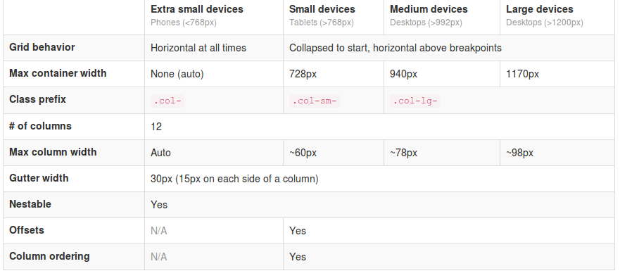
Responsive design is hot, so responsive advertising is hot too. That’s why we see many new ads techniques and strategies. You will find a nice example of technique on Responsive Banner Ads with HTML5 and CSS3. Or maybe the GASP project will bring nice responsive html5 advertisements in future.
Also platforms like responsiveads.com introduce innovative techniques to show banners on responsive websites. And Google had announced to change their Adwords programm to responsive ads starting june of this year.

You will find responsive ads strategies on responsiveads.com too. To get some ideas take a look at their Ad Formats & Showcase page.

At the moment most advertisers have not adopt new responsive techniques. So i was looking for techniques and strategies to show conventional graphical banners on a responsive website. As i wrote earlier in responsive images (Dutch only) we can’t detect phone orientation or even screensize/viewport server side. Javascript can be a bridge between the media query detection of the viewport and the server side scripting. A solution for this is described on Firing Responsive jQuery Functions based on CSS Media Queries Rather than Window Width. The post gives also some other solutions: MediaCheck,jRespond and Breakpoints.js.

I found MediaCheck intuitive and uptodate so i build a proof of concept with it. Based on the viewport i load different banner formats on different positions. You can see the results by viewing the demo page on responisator or download the source on Github.

With MediaCheck you define your breakpoints based on CSS Mediaqueries like:


mediaCheck({
media: '(max-width: 420px)',
entry: function() {
console.log('starting 420');
},
exit: function() {
console.log('leaving 420');
}
});

MediaCheck is initialized with the jQuery Document Ready call so the banners are load after the page loads. This seems the main disadvantage of this method. On the other side this method prevents you from loading too much data to the client. None of the banners is hide or resize by CSS. You can use your banner loads for statistics. Every banner load should be a real view except from changing phone orientation maybe.

Responsive images

In een eerdere post schreef ik al dat het in het kader van responsive design het logisch lijkt niet alles client side op te lossen. Niet veel later leerde ik via @nielsvanmidden dat deze techniek RESS genoemd wordt. Voluit spreekt men dan van Responsive Design + Server Side Component.

Responsive images

In websites gebruikte afbeeldingen leek mij interessant om nader te bekijken. Ter illustratie een voorbeeld:

Een website geoptimaliseerd, of maximaal getoond, voor een breedte van 960 pixels. Zo’n site heeft bijvoorbeeld een header images van 960 x 300 pixels. Wordt deze website nu op een mobiele telefoon bekeken, dan wordt de header d.m.v. css op 100% schermbreedte gezet. De mobiel in portret view geeft de header dus afgebeeld als 320 x 100 pixels. Wordt deze afbeelding nu d.m.v. css (media queries) herschaald, dan wordt eerst de volledige afbeelding op de telefoon gedownload, de hardware van de telefoon herschaalt deze vervolgens. Was een afbeelding van 320 x 100 pixels van de server gedownload, dan was dit sneller gegaan en de gebruiker had minder dataverkeer verbruikt.

Mogelijke oplossing

Server side wordt het gebruikte device bepaald. Vervolgens stuurt de server de afbeelding van de juiste afmeting. Voor de oplossing ga ik uit van een willekeurige webserver (LAMP) waarbij alle afbeeldingen in één directory staan. Bijvoorbeeld /images/ (subdirs toegestaan). Middels Mod rewrite stuur ik alle request /image/* naar mijn script (ti.php):

RewriteEngine On
RewriteCond $1 !=ti.php
RewriteRule ^(.*)$  /image/ti.php

In ti.php wordt het device bepaald. Afhankelijk van het device rendeert ti.php de juiste afbeelding. ti.php kent de oorspronkelijke REQUEST_URI. Het script kan de opgevraagde afbeelding openen, herschalen en renderen. Qua device zou je bijvoorbeeld kunnen splitsen op mobiele telefoons, tablets en desktops. Voor mobiele telefoons hoeft een afbeelding dan niet breder dan 480 pixels te zijn (???).

Het bepalen van een device kan gebeuren met Mobile Detect.

Voordeel van deze oplossing dat je deze op elke website server kunt installeren los van het CMS dat gebruikt wordt. Enige dat je feitelijk hoeft te doen is de files uploaden naar je directory met afbeeldingen. Dat gaat dan om een .htaccess bestand, ti.php en de Mobile Detect files. Er zijn ook geen wijzigingen nodig aan je html.

Deze oplossing werkt in theorie, in de praktijk zijn er ook enkele nadelen.

Te weinig profijt

Veel sites hebben weinig hele grote afbeeldingen, voor veel sites betreft het alleen de header. Hoewel er altijd winst is, kunnen de voordelen gering zijn. Voor een website met veel foto’s, die ook op desktop foto’s herschaalt middels css (of width i/d img tag) zou de winst daarentegen wel enorm kunnen zijn.

Landscape / portret view

Mobiele telefoons hebben meestal een landscape en portret view. Bij het wisselen tussen de landscape en portret view wordt de pagina niet herladen, afbeeldingen kunnen middels css wel opnieuw schalen. Voor images die je getoond wilt hebben met 100% van de schermbreedte betekent dit dus, dat de afbeelding die je laat laden minimaal een breedte moet hebben gelijk aan de maximale schermbreedte in de landscape view.
Vervolgens heb ik bijvoorbeeld gekeken naar: http://twitter.github.com/bootstrap/scaffolding.html#responsive “Supported devices”. Dan blijkt er eigenlijk een overlap tussen telefoons en tablets met een breedte tussen de 480 en 767 pixels. Dat zijn grote telefoons of kleine tablets.
Onduidelijk is of Mobile Detect nauwkeurig genoeg is om te bepalen of een device valt onder bijvoorbeeld maximaal 480px breed (landscape).
Zie hiervoor ook: Obtaining max device width. Indien de bepaling niet strikt genoeg is zou je voor elke telefoon voor de zekerheid moeten uitgaan van 767 pixels, een steeds geringer verschil met de originele 960 pixels.

A Simple Device Diagram for Responsive Design Planning laat zien dat er feitelijk maar één breakpoint mogelijk is. Dit breakpoint ligt dan bij 480px.

The MobileESP Project  is een andere library om devices te detecteren. MobileESP is beschikbaar voor PHP, Java, ASP.NET (C#), Python (voor Django), Ruby en Classic ASP (VBscript). Tevens is er een javascript versie en een api beschikbaar. Via MobileESP zou, mogelijk niet heel strikt, een onderscheid gemaakt kunnen worden tussen telefoon en tablets met een scherm tot 7inch en een groep met schermen tot 8inch. 7inch schermen zouden een resolutie hebben van 480×800. Via deze route zou je een breakpoint op 800 pixels kunnen bepalen.

Alternatief

Alternatief zou kunnen zijn om de server side Mobile Detect te vervangen door een client side javascript detectie. Voorbeeld is te vinden op https://github.com/filamentgroup/Responsive-Images. Eerste nadeel van deze methode lijkt dat je de images pas kunt laden nadat de pagina geladen is. In het genoemde voorbeeld wordt ook  met maar één breakpoint gewerkt. Het onderscheid is dus groot of klein. Probleem met de landscape en portret view blijft bestaan.