NO, i did NOT switch from Less to Sass!

ince i announced my new Book a while ago, many people already asked me if i did switch from Less to Sass. My new book is called “Sass and Compass Designer’s Cookbook” and before i wrote some books about Less. I’m not going to tell you which pre-processor for CSS code you should use. Many others already wrote about Less vs Sass. I only advice you to use a pre-processor for CSS ever, if you do not yet you should start today!

CSS pre-processors like Sass and Less help you to code your CSS code DRY (Do not Repeat Yourself). Pre-processors solve the disability of CSS to use variables and function to prevent code duplications. Coding non-DRY CSS code every day is definitely a defect in your develop process and there is no reason to not fix this defect directly!

What are the differences between Sass and Less? Sass has been written in Ruby and Less in JavaScript (original in Ruby too).

Less runs in Node and browser (client side), Rihno support seems to be dropped since v2, but their is also less4j. Most people will only use Less in browser for testing purposes. Less in Node can be used for the command line compiler and easily integration with task runners like Grunt and Gulp to set up complete build chains.

On the other hand there is libsass, the c/c++ library with interpreters for C, Node, JavaScript and even Ruby. The JavaScript interpreter enable you to run Sass in browser too, whilst node-sass can be used to set up a build chain.

I think the big difference will be the language itself. Less is declarative language designed to behave and look as closely to css as possible. Sass on the other hand looks more like a imperative language. Both languages extend CSS with variables, nesting, mixins and inheritance. Sass allows function whilst Less does not, Sass uses if / else statement and Less uses guards to achieve the same. Same for loops; Sass has a @while and @for directive and Less uses guards here too.

Side effects of the declarative nature of Less are the lazy loading and last declaration wins rule for variables, which means that you can easily override any variable by putting the definition afterwards. The ability to put a variable definition afterwards makes Less very suitable to implement flexible frameworks and other reusable structures.

But i’m sure that you are still wondering which pre-processor you should use for your project. I think your choice should depend on the components and frameworks you will use for your project. When you start a Foundation project you will choose Sass and for a Bootstrap 3 project Less will be a better choice.

You should notice that Bootstrap 4 switches from Less to Sass recently. Their motivation: “Sass  compiles faster than ever thanks to Libsass, and we join an increasingly large community of Sass developers”. The choice of the Bootstrap team could be the kiss of death for Less. Even if so, this is still not a proof of the superiority of Sass, because of factors which cause such a lock-in, or path-dependence may be very complex. Also remember the Video 2000 system of Philips or your own QWERTY keyboard.

Why does Bootstrap have nav and nav-stacked as different classes?

The “Why does Bootstrap have nav and nav-stacked as different classes?” was original posted on stackoverflow. You could ask the same for the .btn and .btn-* classes or the .navbar classes and many other classes in Bootstrap’s Less code.

In short: CSS size (there’re hundreds of such specific-class/base-class tiers so if each .btn-sm would inherit its .btn stuff even via extend, the size of the resulting CSS increases dramatically. Now counting that there was no extend when Bootstrap started, so each sub-class would have to copy the properties, the resulting CSS size becomes just unexpectedly enormous (literally tens-to-hundreds times larger then it is now)). Other reasons may exist as well. – seven-phases-max

I think @seven-phases-max is right in the above comment.

When you extend the same class many time the selector list become relative long:

Example:

    .btn {
    border: 1px solid;
    }
    
    .btn-small:extend(.btn){};
    .btn-medium:extend(.btn){};
    .btn-large:extend(.btn){};

The above Less code compile in to .btn,

    .btn-small,
    .btn-medium,
    .btn-large {
      border: 1px solid;
    }

In the preceding the long (and growing) list is: .btn-small, .btn-medium, .btn-large.

The “best” (or most logic way) to solve the above seems to use a using attribute selectors as follows:

[class^="btn-"], [class*=" btn-"] {
       border: 1px solid;
    }

Bootstrap does not use attribute selectors because of performance issues, see also: https://github.com/twbs/bootstrap/issues/10332. Read also http://benfrain.com/css-performance-revisited-selectors-bloat-expensive-styles/

Because of attribute selectors are not allowed, using base classes seems to be the way to prevent the selector list grows to set only a small amount of shared properties.

Less for the Ionic framework

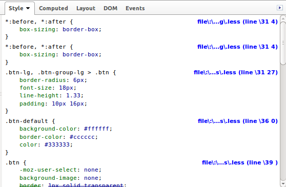
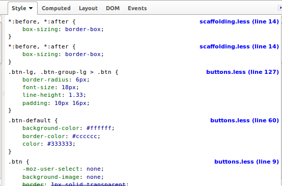
This week I started to build a Less version for the Ionic framework. The Ionic framework, or shortly Ionic is a beautiful, open source front-end SDK for developing hybrid mobile apps with HTML5.

Why should you need a Less version when there’s already a SASS version? Well, I know that Less vs SASS had been discussed a thousands times. Personally i like Less because of its syntax stays as close as possible to the declarative nature of CSS. But i also really believe that Less is more suitable than SASS for CSS framework like Ionic because of its lazy loading nature. Lazy loading and apply the last declaration wins rule, which means that you can easily override any variable by putting the definition afterwards.

The example from the official Less documentation shows you what the preceding exactly means:

// library
@base-color: green;
@dark-color: darken(@base-color, 10%);

// use of library
@import “library.less”;
@base-color: red;

Secondly having a Less version will enable me to write a Less plugin for Ionic. This plugin imports the library before your custom code, without the need to explicit import it in your code. After installing the plugin you can simply compile your code with the following command:

lessc apllication.less application.css –ionic

Read now the Formula which describe how to deploy Ionic apps with Less: Customize your Ionic app’s theme with Less. This Formula uses the Less autoprefix plugin and the Less ionic plugin.

Migrate Ionic from SASS to Less

I decide to do the migration in 3 steps:

  1. First rewrite the basic system in Less; reset, scaffolding, type and grid (also ionicons cause they’ve got a Less version already)
  2. Include the autoprefix plugin in the build chain
  3. Rewrite other code, including components

About the autoprefixer

I found that many the purpose of many of the current mixins in Ionic is only adding CSS vendor prefixers. The / a autoprefix postprocessor can add these vendor prefixers automatically. Since version 2 of Less you can also use the Less autoprefix plugin of this task. Alternatively you can use gulp-autoprefix in the build chain too. Also notice there is no reason to not use the autoprefixer with SASS too.

How does this works?

The SASS code contains the following mixin:

@mixin align-items($value: stretch) {
@if $value == flex-start {
-webkit-box-align: start;
-ms-flex-align: start;
} @else if $value == flex-end {
-webkit-box-align: end;
-ms-flex-align: end;
} @else {
-webkit-box-align: $value;
-ms-flex-align: $value;
}
-webkit-align-items: $value;
-moz-align-items: $value;
align-items: $value;
}

To do the same in Less, you will need some kind of helper mixin, as can be seen in the following code:

.ms-align-items(@value: stretch) when (@value = flex-start) {
-webkit-box-align: start;
-ms-flex-align: start;
}
.ms-align-items(@value) when (@value = flex-end) {
-webkit-box-align: end;
-ms-flex-align: end;
}
.ms-align-items(@value) when (default()) {
-webkit-box-align: @value;
-ms-flex-align: @value;
}

.align-items(@value) {
.ms-align-items(@value);
-webkit-align-items: @value;
-moz-align-items: @value;
align-items: @value;
}

When using the mixins above:

div.flex-end {
@include align-items(flex-end);
}

or

div.flex-end {
.align-items(flex-end);
}

outputs:

div.flex-end {
-webkit-box-align: end;
-ms-flex-align: end;
-webkit-align-items: flex-end;
-moz-align-items: flex-end;
align-items: flex-end; }

When using the autoprefixer you Less (or SASS) code will look like that shown below to do the same:

div.flex-end {
align-items: flex-end;
}

The following command:

echo “div.flex-end { align-items: flex-end; }” | lessc – –autoprefix

outputs:

div.flex-end {
-webkit-box-align: end;
-webkit-align-items: flex-end;
-ms-flex-align: end;
align-items: flex-end;
}

The preceding look well, but the -moz-align-items: flex-end; declaration is missing. This can be fixed by brute adding prefixes for even the most old browsers by running:

echo “div.flex-end { align-items: flex-end; }” | lessc – –autoprefix=”last 20 versions”

The above indeed adds the -moz-align-items: flex-end; declaration, but it seems nicer to set the supported browser more specific. I could not find which browsers Ionic should support. But i found that it support only browsers with flexbox support. So for now i will use the following command:

echo “div.flex-end { align-items: flex-end; }” | lessc – –autoprefix=”Android >= 2.1,BlackBerry >= 7,Chrome >= 20,Firefox >= 21,Explorer >= 10,iOS >= 3.2,Opera > 12,Safari > 6,OperaMobile >= 12.1,ChromeAndroid >= 40,FirefoxAndroid >= 30,ExplorerMobile >= 10″

Now the above commands outputs as desired:

div.flex-end {
-webkit-box-align: end;
-webkit-align-items: flex-end;
-moz-box-align: end;
-ms-flex-align: end;
align-items: flex-end;
}

When applying all the above the Less gulp task should look like that shown beneath:

gulp.task(‘less’, function(done) {
var LessPluginAutoprefix = require(‘less-plugin-autoprefix’),
autoprefix = new LessPluginAutoprefix({ browsers: [“Android >= 2.1″,”BlackBerry >= 7″,”Chrome >= 20″,”Firefox >= 21″,”Explorer >= 10″,”iOS >= 3.2″,”Opera > 12″,”Safari > 6″,”OperaMobile >= 12.1″,”ChromeAndroid >= 40″,”FirefoxAndroid >= 30″,”ExplorerMobile >= 10”] });

gulp.src(‘less/ionic.less’)
.pipe(header(banner))
.pipe(less({
plugins: [autoprefix],
onError: function(err) {
//If we’re watching, don’t exit on error
if (IS_WATCH) {
console.log(gutil.colors.red(err));
} else {
done(err);
}
}
}))
.pipe(concat(‘ionic.css’))
.pipe(gulp.dest(buildConfig.dist + ‘/css’))
.pipe(gulpif(IS_RELEASE_BUILD, minifyCss()))
.pipe(rename({ extname: ‘.min.css’ }))
.pipe(gulp.dest(buildConfig.dist + ‘/css’))
.on(‘end’, done);
});

Should both SASS and Less code maintained?

As has been mentiond rightly at https://github.com/driftyco/ionic/issues/2252 maintaining two version does not seem teh right way to go. Possible fixes: Bootstrap SASS has been automaticaly created from the Less version and @kristoferjoseph from flexboxgrid.com suggests to build a CLI /JavaScript process that ouputs code for different preprocessors.


update

Autoprefixing:

The .touch-callout(none); mixin add only the -webkit-touch-callout: @value;. The autoprefixer does not efficient solve the preceding. When we code touch-callout: none; the -webkit- is not add (and the unprefixed property is not removed). On the other hand it is not sure if the right prefixes are addded in future, when we code -webkit-touch-callout: @value;. The .touch-callout(none); mixins in not removed for now.

I also found a difference for the order property.

When coding order: 3 the original mixin outputs:

-webkit-box-ordinal-group: 3;
-webkit-order: 3;
-moz-box-ordinal-group: 3;
-ms-flex-order: 3;
order: 3;

The autoprefixer outputs in this situation:

-webkit-box-ordinal-group: 4;
-webkit-order: 3;
-moz-box-ordinal-group: 4;
-ms-flex-order: 3;
order: 3;

Although i could not find any documentation that suggest to increase the value of the *-box-ordinal-group, the incrementation could make sense cause the initial value of *-box-ordinal-group property is 1 whilst the order property has got an initial value of 0.

The -webkit-font-smoothing property is only be used by Webkit browsers. Because of -webkit-font-smoothing has no official syntax, this property is also not supported by the autoprefixer. There is no reason to expect that other browser will start using this property in future. Also the original mixin seems to be incorrect because of the font-smoothing property does not exist:

.font-smoothing(@font-smoothing) {
-webkit-font-smoothing: @font-smoothing;
font-smoothing: @font-smoothing;
}

The mixin has been removed from the Less code in favor of coding -webkit-font-smoothing directly. The same seem true for the .touch-callout(none); mixin hindsight. Also the .touch-callout(none); mixin has been removed.

FireLess and Less v2

In my Less Web Development Essentials book which can be found at https://www.packtpub.com/web-development/less-web-development-essentials i refer to FireLess for client side compiling and debugging Less code. When compiling your Less code in browser you can not use CSS sourcemaps to map the compiled code to its origin. There’s no technical barrier to get inline source maps working with Less in browser, but browsers do not support inline sourcemaps inside inline CSS code. More information can be found at: https://github.com/less/less.js/issues/1541

So for people who develop their Less code in browser FireLess can replace the CSS sourcemaps functionality for now. The Firebug add-on integrates with Firefox to put a wealth of development tools and FireLESS in a browser add-on for FireFox that allows Firebug to display the original LESS file name and line number of LESS-generated CSS styles.

The FireLess code seems not to be up to date, or at least on the website there’s is a message telling you:

Currently requires a patched version of LESS available at ….

A recent patched version of Less can not be found any more. Other comments on the website says no patched version has been required since Less version 1.5. I have tested FireLess with the latest 2.2.0 version of Less. Without any modification i found that the add-on shows the names and line numbers, but the names are not showed well and the line numbers got a 3 prepend and obviously show the wrong numbers at all, as can be seen in the following figure:

fireless

The figure above runs the following code:

<link type=”text/css” href=”bootstrap3/bootstrap/less/bootstrap.less” rel=”stylesheet/less”>
<script>
var less = {
env: “development”,
dumpLineNumbers: “mediaquery”,
};
</script>
<script src=”//cdnjs.cloudflare.com/ajax/libs/less.js/2.2.0/less.min.js”></script>

Notice that FireLess requires the dumpLineNumbers: "mediaquery" option. The code returned by Less with that option set will look like that shown below:

@media -sass-debug-info{filename{font-family:file\:\/\/http\:\/\/testdrive\/bootstrap3\/bootstrap\/less\/normalize\.less}line{font-family:\0000333}}

As you can see, each URL seems to start with file\:\/\ (back slashes used for escape). The file\:\/\ prepended to the file path seems wrong (this issue has been fix in release 2.3.0). Also the values set for the font-family property are not surrounded by quotes.

There will be no need to writing a patched version to fix these issues since version 2 Less. Less v2 enables you to write easily a plugin. A postprocess plugin, which modify the compiled CSS code, can be used to correct the already mentioned issues.

You can use the following code:

<link type=”text/css” href=”bootstrap3/bootstrap/less/bootstrap.less” rel=”stylesheet/less”>
<script>
function FireLessProcessor(options) {};
FireLessProcessor.prototype = {
process: function (css) {
css = css.replace(/(@media -sass-debug-info\{)(.*)(\}\n)/g,function(m1,m2,m3,m4){
m3 = m3.replace(‘file\\:\\/\\/file\\:\\/\\/’,’file\\:\\/\\/’);
m3 = m3.replace(‘file\\:\\/\\/http\\:\\/\\/’,’http\\:\\/\\/’);
m3 = m3.replace(‘file\\:\\/\\/https\\:\\/\\/’,’https\\:\\/\\/’);
m3 = m3.replace(/(font-family:)([^}]+)(})/g, function(r1,r2,r3,r4){
return r2 + ‘”‘ + r3 + ‘”;’ + r4;
});

return m2 + m3 + m4;
});
return css;
}
};
var FireLess = {
install: function(less,pluginManager) {
pluginManager.addPostProcessor(new FireLessProcessor());
}
};

var less = {
env: “development”,
dumpLineNumbers: “mediaquery”,
plugins: [FireLess]
};
</script>
<script src=”//cdnjs.cloudflare.com/ajax/libs/less.js/2.2.0/less.min.js”></script>

With the preceding code the FireLess add-on shows both file names and lines number as expected as can be seen in the following figure:

fireless fixed with Plugin

I have tested the plugin code above only on Linux, when you are on a Windows machine for some reason, you should possible need more or different fixes for the file paths.

Packt’s $5 eBonanza returns

Packt’s $5 eBonanza returns
My first book “Less Web Development Essentials” was published by Packt Publishing and also my coming book “Less Web Development Cookbook” will be publish be Packt Publishing. It’s a real pleasure to work with Packt Publishing. They will give all the support I need to write my books. I also love that Packt supports open source projects with their Open Source Project Royalty Scheme.

Beside my own books, Packt Publishing publish many other interesting titles. Such as “Learning Zurb Foundation” by Kevin Horek which I have reviewed myself last year.

With only some days to go till 2015 it’s definitely time for you to start learn something new. Maybe you want to learn Less, responsive webdesign, WordPress, Bootstrap or Foundation, but whatever you choose, i will be sure that Packt Publishing have the right e-book for you. Packt publishing will help you further with the eBook Bonanza. Treat yourself to the eBook or Video of your choice for just $5 (€ 4.80) and get as many as you like until January 6th 2015.

Go to the eBook Bonanza and order your e-book now!

How to change Bootstrap’s carousel animation

The popular carousel plugin of Bootstrap has been used on many websites. The jQuery plugin itself uses CSS class from the Less code of Bootstrap. So you can not change the classes names use for the carousel structure (without changing the plugin too).

In most situations you will not change the original source code of Bootstrap, to make easy updating possible.

In stead of changing the class name you can add an additional class to bind new animations to the carousel.

An example can be found at: http://www.bootply.com/Tbey4dxan1

For the example above i have add a anim class to the div with the role="listbox" as follows:

<div class=”carousel-inner anim” role=”listbox”>

After that i can use the carousel-inner anim in the Less code for my alternative animations. The carousel-inner anim selector automatically got a higher specificity than the original carousel-inner selector.

For the demonstration i have use two animations from Animate.css. The Less code for the flip animation will look like that shown below:

@keyframes flip {
0% {
transform: perspective(400px) rotate3d(0, 1, 0, -360deg);
animation-timing-function: ease-out;
}

40% {
transform: perspective(400px) translate3d(0, 0, 150px) rotate3d(0, 1, 0, -190deg);
animation-timing-function: ease-out;
}

50% {
transform: perspective(400px) translate3d(0, 0, 150px) rotate3d(0, 1, 0, -170deg);
animation-timing-function: ease-in;
}

80% {
transform: perspective(400px) scale3d(.95, .95, .95);
animation-timing-function: ease-in;
}

100% {
transform: perspective(400px);
animation-timing-function: ease-in;
}
}

.flip {
backface-visibility: visible;
animation-name: flip;
animation-duration: 0.6s;
}

I have add the animation-duration property into the .flip selector, which can be used as mixin now. Notice that CSS animation require some vendor prefixes for cross browser compatibility. I do not use vendor prefixes in my Less code but run an autoprefixer afterwards leveraging the Less Autoprefix plugin. After creating the Less code for the animation, i will create the Less code carousel-inner anim selector, which will look as follows:

.carousel-inner.anim {

> .active {
left: 0;
}

> .next,
> .prev {
position: absolute;
top: 0;
width: 100%;
}

> .next.left {
.flip();
left: 0;
}
> .prev.right {
.rotateInDownLeft();
left: 0;
}
> .active.left {
left: -100%;
}
> .active.right {
left: 100%;
}
}

I also found some related questions on Stack Overflow;
http://stackoverflow.com/questions/26770055/bootstrap-carousel-fade-no-longer-working-with-maxcdn-3-3-bootstrap-min-css and http://stackoverflow.com/questions/27626096/bootstrap-carousel-fade-not-working-on-images-need-help-understanding-why.

I have tested the above solutions on both Chrome and Firefox. In some situations (or for some browsers) you should possible also reset the original transitions. You could try to do this reset by using the following Less code:

.carousel-inner {

> .item {
transition: none;

// WebKit CSS3 transforms for supported devices
@media all and (transform-3d), (-webkit-transform-3d) {
transition: none;
backface-visibility: hidden;
perspective: 1000;

&.next,
&.active.right {
transform: none;
left: 0;
}
&.prev,
&.active.left {
transform: none;
left: 0;
}
&.next.left,
&.prev.right,
&.active {
transform: none;
left: 0;
}
}

}
}


Howto smoothly fade in your slides

For fade-out and fade-in effect, your slides should be stacked (using position absolute). An demo can be found here. For a more detailed explanation you should read my answer at stackoverflow: Bootstrap carousel refuses to transition smoothly after css adjustments. This example will also show you that the Bootstrap 3d-translations can indeed easily be reset by using the following Less code:

.carousel-inner > .item {
transform: translate3d(0,0,0) !important;
}


Compile Bootstrap with Less v2 and the autoprefix plugin

Since Bootstrap v3.2 the grunt autoprefixer plugin is part of Bootstrap’s build process. This autoprefixer postprocessor makes the prefix mixins (found in less/mixins/vendor-prefixes.less) deprecated.

Less 2 introduced plugins for the Less compiler, see also http://lesscss.org/usage/#plugins. These plugins enables you to add your own postprocessors. Postprocessors change the compiled CSS code. An example can be found at: http://stackoverflow.com/a/26539622/1596547

Less provides its own autoprefixer plugin now. Leveraging the Less autoprefixer plugin enables you to compile the Bootstrap CSS without running Grunt.

  1. Download and unzip Bootstrap’s source files. These files can be found at: https://github.com/twbs/bootstrap/archive/v3.2.0.zip
  2. When you have not done yet. Update Less to version 2: npm -g update less
  3. Than install the autoprefix plugin by running npm -g install https://github.com/less/less-plugin-autoprefix/archive/master.tar.gz (soon you should be able to run npm -g install less-plugin-autoprefix too)(for now run npm install https://github.com/less/less-plugin-autoprefix/archive/master.tar.gz, which install the latest version and supports options)

Now you can compile Bootstrap’s CSS by running in your console:
lessc --autoprefix='Android 2.3,Android >= 4,Chrome >= 20,Firefox >= 24,Explorer >= 8",iOS >= 6,Opera >= 12,Safari >= 6' less/bootstrap.less bootstrap.css

The autoprefix plugin takes care for your v3 source maps too, when running the compiler with the --source-map or --inline-source-map option. Use the compiler’s -x open to compress your compiled CSS code. Since Less v2 the clean-css option has also been moved into in plugin. You can install the clean-css plugin by running npm install less-plugin-clean-css.

Be prepared for Bootstrap v4

The upgrade from Twitter’s Bootstrap 2 to Bootstrap 3 was not painless. The current 3.2.0. release will give you some insights for the coming v4 release of Bootstrap. The 3.2.0. already adds some new things such as the responsive utility classes now have variants for diferents CSS display property values. The most important change till now, seems to be the adding of vendor prefixes to the CSS code automatically.

Responsive utility classes

In stead of the .visible-* classes (deprecated as of v3.2.0) you are now enable to use or .visible-*-block, .visible-*-inline or .visible-*-inline-block. The hidden-* classes don’t change because of they set the display to none always. The .visible-*-inline classes can be used to hide and display inline elements such as the <span> element. Consider the following example code to see the difference:

<p>This is a paragraph. <span class="visible-xs">(Small grid)</span>.</p>
<p>This is a paragraph. <span class="visible-xs-inline">(Small grid)</span>.</p>

As you can see in the image shown beneath, the layout of the paragraph has been broken in the first situation:

Wrong layout of the paragraph due to display:block

The .visible-xs class changed the display of the span element to block. Block level elements start on a new line and take all available space.

Better responsive display for embedded media

Bootstrap adds new classes for embedding media with <iframe>, <embed> and <object> elements. These classes keep the aspect ratio of your media intact when scaling down for different screen widths. With Bootstrap 3.2 you can use the following code:

<!-- 16:9 aspect ratio -->
<div class="embed-responsive embed-responsive-16by9">
<iframe class="embed-responsive-item" src="…"></iframe>
</div>

Try it a find your videos will look great again. Use the .embed-responsive-4by3 class for the 4:3 ratio.

Using autoprefixer as part of build system

The autoprefixer adds vendor prefixes to your CSS code automatically. Using the autoprefixer allows you to only use W3C property declarations in the Less code. More clean and consistent Less code will be the big win here. Note that as also described in my Less Web Development Essentials book:

Vendor-specific rules also provide us with early implementations of standard properties, and alternative syntax.

If you take a look into the <code>/less</code> directory you will find that the mixins are modularized into separate files inside the <code>/less/mixins</code> directory. Before v3.2.0 vendor prefixes where set by mixins. These mixins for vendor prefixes are moved to the less/mixins/vendor-prefixes.less for backward compatibility reasons now. These vendor prefixes are deprecated as of v3.2.0 and will be dropped in v4.

Who used Grunt to build the Bootstrap CSS already will full profit from these change. People who compile the Bootstrap Less code with an other Less compiler for their projects will find some troubles since version v3.2.0. Till v4 new and improved code will not any longer prefixed by Less. Impossibilities in your build process to auto prefix your code automatically will cause non-prefixed CSS in your code base.

To get insight in the consequences of these change you can compare the CSS code build with the Bootstrap build process and the CSS code when compiling with Less directly. Run the following commands in your Bootstrap directory:


>> grunt dist
>> lessc less/bootstrap.less nonprefixed.css
>> diff -b nonprefixed.css dist/css/bootstrap.css

After running the preceding command you will find for instance the following code:

1345c1359,1360
< box-shadow: inset 0 -1px 0 rgba(0, 0, 0, 0.25);
---
> -webkit-box-shadow: inset 0 -1px 0 rgba(0, 0, 0, .25);
> box-shadow: inset 0 -1px 0 rgba(0, 0, 0, .25);

When inspecting the compiled CSS will show you that the box-shadow property for the kbd selector is not prefixed if not using the autoprefixer. The preceding will be due to the Less code for the kbd selector in the less/code.less file does not call the .box-shadow() mixin. Before v3.2.0 not calling the prefixed mixins could be considered as an bug, since v3.2.0 these issues are solved by the autoprefixer automatically. Cause the non mixin calling code will be the prefered code for version 3.2+ and the coming version 4 of Bootstrap this code should not changed any more. Consequently the browser support of the CSS code which has been compiled by Less directly and did not run through the autoprefixer will decrease compared to Bootstrap original CSS code.

The best solution for this issue is to change your build process to enable the autoprefixer as recommended by Bootstrap. Unfortunately some situations can’t be solved this way. Grunt and so the autoprefixer requires Node.js which is not available in some situations. You can read more about this issue in my next post about the JBST WordPress starters theme, which has a built-in Less compiler based on PHP.

WordPress theming, the comment_form() call, and the power of Less

When preparing the upload of the next version of JBST to wordpress.org I found the usage of comment_form(). The documentation of comment_form() can be found at Function Reference/comment form. The documentation of comment_form() doesn’t explain why you should have to use this comment_form() call instead of code your comment form’s HTML directly into your comments.php template. On the first sight using comment_form() and setting the comment form field’s HTML by PHP as an function argument or inside a filter, seems the break the MVC principle. Templates should not contain PHP code at all.
Arguments to motivate the usage of comment_form() can be found at WordPress 3.0 Theme Tip: The Comment Form. Standardization is an important argument:

The comment_form function is new to 3.0. Basically, it standardizes the comments form. It makes it wonderful for us plugin authors, since now we can easily modify the comments form with various hooks and things.

When using comment_form() the HTML of the form fields can be set in two different ways, as shown below:

In the first place you can use the comment_form_default_fields filter. The comment_form_default_fields filter return an associative array which contains the HTML for each field as can be seen in the following code:


add_filter( 'comment_form_default_fields', function(){ 

	$commenter = wp_get_current_commenter();
	$req = get_option( 'require_name_email' );

	return array(

    'author' =>
      '<div class="form-group">
			  <label for="author">' . __("Name",'jamedo-bootstrap-start-theme')
			 . ($req ? " (". __("required",'jamedo-bootstrap-start-theme') .")" : '')
			 . ' </label>
			  <div class="input-group">
			  	<span class="input-group-addon"><i class="glyphicon glyphicon-user"></i></span>
			  	<input class="form-control" type="text" name="author" id="author" value="'
			  	. esc_attr($commenter['comment_author']). '" placeholder="'
			  	. __("Your Name",'jamedo-bootstrap-start-theme'). '"'
			  	. ($req ? ' required aria-required="true"' : ''). '/>'
			  . '</div>'
		  	. '</div>',

    'email' =>
      '<div class="form-group">
			  <label for="email">' . __("Email",'jamedo-bootstrap-start-theme')
			 . ($req ? " (". __("required",'jamedo-bootstrap-start-theme') .")" : '')
			 . ' </label>
			  <div class="input-group">
			  	<span class="input-group-addon"><i class="glyphicon glyphicon-envelope"></i></span>
			  	<input class="form-control" type="email" name="email" id="email" value="'
			  	. esc_attr($commenter['comment_author_email']). '" placeholder="'
			  	. __("Your Email",'jamedo-bootstrap-start-theme'). '"'
			  	. ($req ? ' required aria-required="true"' : ''). '/>'
			  . '</div>'
			  . '<span class="help-block">'. __("will not be published",'jamedo-bootstrap-start-theme'). '</span>'
		  	. '</div>',

    'url' => '<div class="form-group">
			  <label for="author">' . __("Website",'jamedo-bootstrap-start-theme')
			 . ' </label>
			  <div class="input-group">
			  	<span class="input-group-addon"><i class="glyphicon glyphicon-user"></i></span>
			  	<input class="form-control" type="url" name="url" id="url" value="'
			  	. esc_attr($commenter['comment_author_url']). '" placeholder="'
			  	. __("Your Website",'jamedo-bootstrap-start-theme'). '"'
			  	. '/>'
			  . '</div>'
		  	. '</div>'
    );}
  );

Secondly, the comment form field’s HTML can set with the array which is passed as an argument to comment_form() as follows:


$args = array ('fields'=> array('author' => '<input id="author" type="text" name="author" />'));
comment_form($args);

Please notice that the value of fields overwrites the settings of the comment_form_default_fields filter. The preceding code don’t set an email or url field which means the comment form won’t have these field too.

When using comment_form() in your templates you don’t have to code the different situations where the user is logged in or not, where the comments are open or closed, and so on. On the other hand you still have to code the function’s argument or filters as shown in the preceding.

Popular themes such as “Twentythirteen” use the comment_form() code which enables (plugin) developers to change the look and feel of the comment form with filters or CSS. In this standard situation theme coders only have to write comment_form() in the comments.php template and style the form with CSS.

WooCommerce

The WooCommerce Plugin uses the comment_form() code to build a review form. The code to create the review form will like that shown as in the following code:


comment_form( apply_filters( 'woocommerce_product_review_comment_form_args', $comment_form ) );


The additional woocommerce_product_review_comment_form_args filter adds extra flexibility for theme and plugin developers. In the following figure you will see how WooCommerce default review form will look:

WooCommerce's review form

JBST’s comments form

For JBST the comments form should be build with Bootstrap’s form classes and structures as can be found at: . To change the default input fields I use comment_form_default_fields filter as shown earlier in this text. Other changes are set by the argument passed to the comment_form() function as shown in the following code:


	comment_form(

			apply_filters ('jbst_comments_form_arguments', array('comment_notes_before' => '',
			'comment_field' => $comment_field,
			'title_reply' => $title_reply))
	);


The comment_form() function has no filters to change the submit button. You can change the text and the ID of the submit button with the argument array, but are not enable to change the HTML of the button (input type="submit"). The submit button can be styled with CSS. To style the submit button in JBST Bootstrap’s button classes are used. This button classes can be applied easily with Less. JBST has a built-in Less compiler. To style the submit button with Bootstrap’s button classes I use the Less code as follows:


#commentform {
	input[type="submit"] {
	&:extend(.btn all, .btn-primary all);
	}
}	


The .btn-primary button style class is variable in JBST, so the final Less code in PHP will look like the following:


#commentform {
	input[type="submit"] {
	&:extend(.btn all, .'.get_theme_mod( 'default_button_style', 'btn-primary' ).' all);
	}
}	


The following figure will show you how JBST comments form will look after the changes described in the preceding:

JBST's comment form


Adding a background gradient to Bootstrap’s navbar with Less

When writing a book about Less and have to answer a question about adding a background gradient to JBST’s navbar the answer was found easy. Bootstrap’s navbar is styled with two CSS classes the .navbar class sets it’s structure while the .navbar-default or .navbar-inverse classes add colors and other styling. Bootstrap’s mixins contain also mixin for CSS3 background gradients. With the preceding knowledge adding a background-gradient will be as simple as writing in Less:

.navbar-default {
#gradient > .vertical(lighten(@navbar-default-bg,10%),darken(@navbar-default-bg,10%));
}

You should append this code to bootstrap.less and recompile Bootstrap. After recompiling the default navbar will be look like that shown below:

Twitter's Bootstrap default navbar with background gradient

Who don’t want to recompile Bootstrap can try to use the compiled CSS directly:

.navbar-default {
background-image: -webkit-linear-gradient(top, #ffffff 0%, #dfdfdf 100%);
background-image: linear-gradient(to bottom, #ffffff 0%, #dfdfdf 100%);
background-repeat: repeat-x;
filter: progid:DXImageTransform.Microsoft.gradient(startColorstr='#ffffffff', endColorstr='#ffdfdfdf', GradientType=0);
}

In the above you should find the values for #ffffff (white, lightest color) and  #dfdfdf (darkest color) yourself.

With Less changing the default background will be easy to:

.navbar-default {
#gradient > .vertical(lighten(@navbar-default-bg,10%),darken(@navbar-default-bg,10%));
}
@navbar-default-bg: purple;

The above will give you a purple gradient as background. Or the horizontal gradient variant:

.navbar-default {
#gradient > .horizontal(lighten(@navbar-default-bg,10%),darken(@navbar-default-bg,10%));
}
@navbar-default-bg: red;

All the above don’t restrict you to use the @navbar-default-bg only, you can choose your own colors or even use the three colored horizontal gradient:

.navbar-default {
#gradient > .horizontal-three-colors(red;white;50%;blue);
}

Which makes your navbar let’s look like shown below:

Twitter Bootstrap 3 navbar with three colors gradient

Buttons

You can also add a gradient to the Bootstrap’s default button with Less in the same way. The CSS classes of these buttons have the same structure as the navbar, the .btn class makes the button and a second class adds it’s styles. Except from the link button there are six default button styles in Bootstrap. To add a gradient to these button you can use the Less code shown below:

// add gradient to alternate buttons
// --------------------------------------------------

.btn-default {
#gradient > .vertical(lighten(@btn-default-bg,10%),darken(@btn-default-bg,10%));
}
.btn-primary {
#gradient > .vertical(lighten(@btn-primary-bg,10%),darken(@btn-primary-bg,10%));
}
// Success appears as green
.btn-success {
#gradient > .vertical(lighten(@btn-success-bg,10%),darken(@btn-success-bg,10%));
}
// Info appears as blue-green
.btn-info {
#gradient > .vertical(lighten(@btn-info-bg,10%),darken(@btn-info-bg,10%));
}
// Warning appears as orange
.btn-warning {
#gradient > .vertical(lighten(@btn-warning-bg,10%),darken(@btn-warning-bg,10%));
}
// Danger and error appear as red
.btn-danger {
#gradient > .vertical(lighten(@btn-danger-bg,10%),darken(@btn-danger-bg,10%));
}

After appending this to to bootstrap.less and recompiling Bootstrap your buttons will look like:

Twitter Bootstrap 3 buttons with background gradient

Also for button you are not restricted to Bootstrap’s default colors, try for instance:

.btn-custom {
.button-variant(black; white; white);
#gradient > .horizontal-three-colors(red;white;50%;blue);
}

Twitter Bootstrap custom button with three colors gradient


Also read: