Release Candidate 2 has important changes for the grid and the grid classes. Read Twitter’s Bootstrap 3 RC2 (important changes)
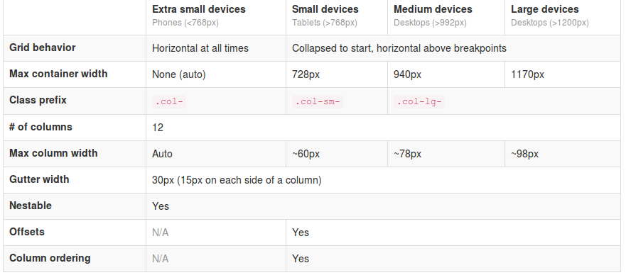
 The most important changes in Twitter Bootstrap 3 will be the more mobile-first approaching and the grid. From now Twitter’s Bootstrap defines three grids: Tiny grid for Phones (<768px), Small grid for Tablets (<992px) and the Medium-large grid for Destkops (>992px). The row class prefixes for these grid are “.col-”, “.col-sm-” and “.col-lg-”. The Medium-large grid will stack below 992 pixels screen width. So does the Small grid below 768 pixels and the tiny grid never stacks. (updated for Twitter’s Bootstrap3 RC1)
Twitter’s Bootstrap 2 defines breakpoints at 480px, 768px, 980px and 1200px. The layout will always be fluid below 768px.
For this reason the ‘old’ span* will not be the same as col-* or col-lg-*. So replacing the class names in your templates will be give you better results. But when looking to an example like http://examples.getbootstrap.com/jumbotron/index.html you will find the the col-lg-* class in place of the former span* class.
Breakpoints
In variables.less you will find:
// Media queries breakpoints
// --------------------------------------------------

// Extra small screen / phone
@screen-xsmall:              480px;
@screen-phone:               @screen-xsmall;

// Small screen / tablet
@screen-small:               768px;
@screen-tablet:              @screen-small;

// Medium screen / desktop
@screen-medium:              992px;
@screen-desktop:             @screen-medium;

// Large screen / wide desktop
@screen-large:               1200px;
@screen-large-desktop:       @screen-large;

// So media queries don't overlap when required, provide a maximum
@screen-small-max:           (@screen-medium - 1);
@screen-tablet-max:          (@screen-desktop - 1);
@screen-desktop-max:         (@screen-large-desktop - 1);

// Grid system
// --------------------------------------------------

// Number of columns in the grid system
@grid-columns:              12;
// Padding, to be divided by two and applied to the left and right of all columns
@grid-gutter-width:         30px;
// Point at which the navbar stops collapsing
@grid-float-breakpoint:     @screen-tablet;
When i test this values if found something different:
- “col-*” will be applied always (never stacks)
- “col-sm-*” will be applied between 768 and higher (992px) (stacks at 767)
- “col-lg-*” will be applied between 992 and higher (stacks at 991)
NOTE: @screen-small is not in use at the moment.
See also http://examples.getbootstrap.com/grid/ for more examples of the grids.
The grid of Twitter Bootstrap 3 has been change to fluid by default. Twitter Bootstrap 3 has only one breakpoint. We will find this breakpoint at 768 pixels. This breakpoint splits small screens and large screens.
Both sides of the breakpoint have a 12 column wide grid. Only modern phone will use the mobile grid, older phoned should only stack. Class names for span and offset are change to col-span-* and -*. Also Twitter Bootstrap 3 introduce new classes (col-small-span-*) for stacking in the mobile grid. You will use this new classes in combination with the standard span and offset classes for large devices:
Imagine you will add two image next to each other in a row.
Twitter Bootstrap 2: (old situation)
<div class=”row”>
<div class=”span6″><img src=”image1.png”></div>
<div class=”span6″><img src=”image1.png”></div>
</div>
On small screens the images will stack with a 100% width in a fluid layout.
Twitter bootstrap 3:
<div class=”row”>
<div class=”col-span-6″><img src=”image1.png”></div>
<div class=”col-span-6″><img src=”image1.png”></div>
</div>
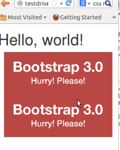
Without adding the mobile classes the images will don’t use the mobile grid and stack with 100% width.
(Note this differs from my expectation. I expected the main classes also should influence the mobile grid.)
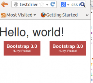
Now we could add the new classes and let the images show next to each other with 50% width:
<div class=”row”>
<div class=”col-span-6 col-small-span-6″><img src=”image1.png”></div>
<div class=”col-span-6 col-small-span-6″><img src=”image1.png”></div>
</div>
You can also use this class to change the way of stacking:
<div class=”row”>
<div class=”col-span-4 col-small-span-12″><img src=”image1.png”></div>
<div class=”col-span-4 col-small-span-6″><img src=”image1.png”></div>
<div class=”col-span-4 col-small-span-6″><img src=”image1.png”></div>
</div>
So we lost some breakpoints but got a small device grid back. Remember offsets are not available with the small grid. Two other new classes are col-pull-* and col-push-*. This classes help you to change the order of your columns. Also these classes are not available with the small grid.
Large screens
The new fluid grid without a default width also lets me think about large screens again. Should i made a decision about the max width of my site when viewed on a large screen? Users who use a site on an large screen with a full screen browsers window should have a reason to do so. So it seems to be more user friendly to let the user choose the max width. I found an interesting article about this: Life Beyond 960px: Designing for Large Screens. At the moment the .container class provides max-widths (728px, 940px en 1170px) for the large grid.


One thought on “Twitter Bootstrap 3 breakpoints and grid”
Comments are closed.