Upgrading to Woocommerce 2

At the request of Jamedo Websites I upgrade the webshop of webvrouw to Woocommerce 2 last week. The upgrade broke my styles on the first sight. After taking a look to the css-files i found Woocommerce functions should be wrap with a woocommerce class now.

Be sure to wrap <?php woocommerce_content(); ?> in a <div class="woocommerce"></div> tag in your theme.

This new css gives also problems when using star-rating and the woocommerce-lightbox. See: Star rating bug.

ShareYourCart integration

After the upgrade the ShareYourCart settings were lost. Also ShareYourCart gives a warning on the checkout page.
Warning: call_user_func_array() expects parameter 1 to be a valid callback, class 'ShareYourCartWooCommerceEx' does not have a method 'showCheckoutButton' in

Update: After updating ShareYourCart to the latest version (1.11.7) the problem with the check-out page is solved. ShareYourCart isn’t a integrated part of Woocommerce any more. ShareYourCart works like any other plugin now.

Twitter Bootstrap Templates

twitter bootstrapTwitter Bootstrap is a front-end toolkit for rapidly developing web applications and websites. It is a collection of CSS and HTML conventions. Twitter Bootstrap is built on LESS. LESS extends CSS with dynamic behavior such as variables, mixins, operations and functions. At the moment i build most website and webapplications with Twitter Bootstrap. Examples Streetart.nl, PKDigitaal, Gizzing and JongerenChat (under construction) and many others.
Most of these websites are build with OpensourceCMS.eu which has been rebuild with Twitter Bootstrap.
Jamedo websites also offers responsive webdesign based on Twitter Bootstrap. Jamedo websites uses the excellent framework of Skematik for WordPress in most cases. Skematik is a GPL WordPress theme + framework designed with Twitter Bootstrap to be the best thing for WordPress ever. With Skematik Jamedo Website build sites like Bougemagic.
The examples above show you can build fantastic responsive websites with Twitter Bootstrap. Of course you will prevent you website looks Bootstrap-y. Many bootstrap website have horizontal menu / navigation. Horizontal elements are easier to implement in a responsive design. But remember you are no restrict to. To create responsive vertical menus you could use for instance Superfish. Superfish is an enhanced Suckerfish-style menu jQuery plugin that takes an existing pure CSS drop-down menu (so it degrades gracefully without JavaScript).
I create Twitter Bootstrap templates you can download for free from github. You can use them to see the technics used to build them. To use them in a production environment you will need a designer definitely.
The first example template is a One Page Sale design. The page has a responsive slider (example page without slider is include too). You can add your product or service, special offers, usp and testimonials. An order page is include too.
The second template set shows you a web shop with vertical menu. Included are homepage, product page, categories and search page.

The Free Twitter Bootstrap Webshop Template set is available for Twitter Bootstrap 3 now. Also read: Migrate your templates from Twitter Bootstrap 2.x to Twitter Bootstrap 3

twitter bootstrap web shop template

Twitter bootstrap buttons

example buttons
Twitter Bootstrap is a front-end toolkit for rapidly developing web applications and websites. It is a collection of CSS and HTML conventions. Bootstrap works with LESS. If you want to use Twitter Bootstrap for your application or website LESS makes it’s possible to tailor made it to fit to your needs. When your are not familiar with LESS you could use tools like Boottheme.com.
Beside all this most people will use Twitter Bootstrap’s default configuration. To do this you can download Twitter Bootstrap from their site or include in from a CDN like BootstrapCDN. On the example page you will find many examples how to use it. You will wrote your own html and CSS(3) to implement your designs. When using buttons Bootstrap offers only 7 colors by default. Write your own css for buttons in the colors you need can be complex. Twitter Bootstrap Button Generator (Plugo labs) and link2 are nice tools to create Twitter Bootstrap Button in different colors. Both tools don’t have the opportunity to input a exact color. So i wrote a new tool which gives you three variations of buttons (dark, light and spin) based on a hexadecimal html color code. Try Twitter Bootstrap Button Generator and generate buttons for Twitter Bootstrap on the fly.

Twitter Bootstrap 3.0 is coming soon

I tested the css code of the Twitter Bootstrap Button Generator on Bootply, see: http://bootply.com/61812. This shows the buttons in the right colors. Hovers don’t work. I will release a version of the generator for Twitter Bootstrap 3 soon.To generate buttons for Twitter’s Bootstrap 3, use this generator.

Bootstrap your (designer’s) mind

bootstrap your mindMost websites are built responsive nowadays. I use Twitter Bootstrap to build responsive websites. Twitter Bootstrap is a front-end toolkit for rapidly developing web applications and websites. It is a collection of CSS and HTML conventions. Twitter Bootstrap is built on LESS. LESS extends CSS with dynamic behavior such as variables, mixins, operations and functions.
The default Bootstrap grid system utilizes 12 columns, making for a 940px wide container without responsive features enabled. When using Bootstrap to build a responsive website you have breakpoints at 480px, 768px, 980px and 1200px.
The first step of a new website is mostly the design of the web designer. We are used to get some psd files. The design is present as desktop view (optimized around a with of around 940 to 960 pixels width) mostly.
When building responsive the first thing to realize is, what happens to the details of the design on a mobile small screen? Some details will disappear cause the don’t fit or are need at all. This can ruin the idea of the designer.
Your designer maybe create an images slider, often seen in WordPress designs today, which looks good on the 960 desktop view. Of course we can create sliders responsive too. Should a mobile visitor appreciate a slider on your website? The slider will cause longer load time and extra scrolling down on a mobile phone. Maybe on bigger screens, 1200+ pixels width, such a slider will give a problem too. A big slider doesn’t look the same and beside that you will need high resolution images. Keep the slider smaller on width screen will cause lots of whitespace which is not consist with the web designers initial ideas.

What should we ask our web designer to get better results?

  1. First to respect the grid system, in our case twitter Bootstrap’s. Details outside the grid like borders and background are lost on smaller screens and are difficult to implement.
  2. Deliver results following the breakpoints. I think the web designer should keep a ‘mobile first’ approach in mind too. Your designer should give you a psd for the mobile phone view max width 320 and no grid), a psd for , etc. The end result should be designs for page in respect to the breakpoints you defined. Also pay attention to navigation and preferred order of display. On smaller screens your navigation will collapsed maybe.
  3. In the case of Twitter Bootstrap the designers should use the Bootstrap’s aspects you won’t change. By default Twitter bootstrap has buttons, forms, etc.

Some examples:

Use default elements

Build your forms with Twitter Bootstrap default like form elements, warnings and buttons.
default bootstrap elements

free psd

On Freepsdfiles.net you can download free psd design. When you look at this example you will see some aspects which not easy fit the bootstrap strategy. First the overlaying phone images. Yes, you could do this in bootstrap too. Using z-indexes and absolute positions. See: example. You will have to adopt all absolute positions for every break point. z-indexes won’t be useful on the small screens without grid. People won’t see the overlaying design effect. And you could wonder if you mobile phone images have any additional value for you mobile visitors at all. Secondly the design had some border effects which don’t fit the grid.

border outside the grid

I will wrote about borders and Bootstrap rows in a next post. Of course borders outside the grid can be visible on big screens you still lose them on smaller screens. More horizon design details can be an alternative maybe.

5 columns wide element

One designer offers my the 5 columns wide element shown below.
5 columns wide design element
This looks nice in the 960 grid view. What to do on bigger screens? Resize all things will give you big screaming fonts. On the other hand don’t resize will give you a lot of white space. One solution can be the center the columns. Also on smaller screen you can’t use the columns. Putting the columns under each other will give you a long scrolling list with a bad user experience. So you will have to find an other solution for small screens too.

Integrate Trustpilot’s Automatische Feedback Service With Woocommerce

Try the WooCommerce Trustpilot Plugin now. This plugin sends the Trustpilot’s BCC email after order processing or completing.

Trustpilot is an open, community-based platform for sharing real reviews of shopping experiences online. You can use Trustpilot with your web shop. To ask customs for reviews Trustpilot sends e-mails. When you open a account you get a unique (secret) e-mail-address to send your order information to. Trustpilot’s software scans this e-mails for the e-mail-address of customer and your orderID. Trustpilot use this information to ask your customers for reviews.

With Automatische Feedback Service e-mails are send directly after the order. You can do this by sending a Bcc (blind carbon copy) of your confirmation e-mail to your unique Trustpilot e-mail-address. Woocommerce has no setting to send such Bcc message by default. To send you blind copy you have to change the code of Woocommerce.

Find the file /wp-content/plugins/woocommerce/classes/class-wc-email.php on your webserver first. Trustpilot ask you to send your order conformation e-mail. Woocommerce also sends an order complete message. I use the order complete message to send the blind copy. In the file mentioned before look up the customer_completed_order function. If you prefer to send the blind copy with the confirmation use the customer_processing_order function.

customer_completed_order contain the line:
$headers = apply_filters('woocommerce_email_headers', '', 'customer_processing_order', $order);

Add the following line of code after this line (replace xxxx@trustpilotservice.com with your own unique e-mailaddress):
$headers .= 'Bcc: xxxx@trustpilotservice.com'."\r\n";

That’s all. Remember this solution isn’t a hook for Woocommerce so you have to repeat this steps when you update your Woocommerce plugin every time.

Update for Woocommerce 2 In Woocommerce 2 the structure of the mail class has been changed. To send your Bcc message to Trustpilot you have to add the email address to /wp-content/plugins/woocommerce/classes/emails/class-wc-email-customer-completed-order.php or wc-email-processing-order.php if you like. The function trigger calls $this->send() change the fifth parameter from $this->get_headers() to this->get_headers().'Bcc: xxxx@trustpilotservice.com'."\r\n".

Responsive banner ads 2

The sample code of my first post about responsive banner ads won’t work in Internet Explorer 9 and lower versions. Internet Explorer 10 will be the first version with support of matchMedia. Also other browsers like Opera lack the support of matchMedia in older versions. See Compatibility table for support of matchMedia in desktop and mobile browsers for a complete overview.

Enquire.js is a lightweight, pure JavaScript library for responding to CSS media queries. Enquire.js won’t support browsers without support of matchMedia by default. You can fix this by using a matchMedia polyfill in combination with Modernizr.

You can use this code:


<script type="text/javascript" src="//cdn.jsdelivr.net/modernizr/2.6.2/modernizr.min.js">
</script><script type="text/javascript">//
<![CDATA[
Modernizr.load([
//first test need for polyfill
{
test: window.matchMedia,
nope: "js/matchMedia.js"
},
//and then load enquire
"js/enquire.js",
"js/responsiveads.js"
]);
// ]]>
</script>

Add you responsive ads code to “js/responsiveads.js”. By example something like:


enquire.register("screen and (max-width: 767px) and (min-width: 481px)", [
{ match : function() { $('#ads').html(""); } }
]).listen();

This code inserts the full link to a div in stead of only the image the src attribute of the img-tag for the reason that empty src attributes show a broken image in Internet Explorer.

Can you use all this to serve responsive Google adsense ads?

In some way, you can. A word of warning: Google forbids to hide any ads or generate false impressions. Or even don’t allow you to change any code. Responsive Google AdSense shows how we can serve ads of different sizes dynamic. Based on screens sizes this methods calls the ads-server with different google_ad_slot, google_ad_height and google_ad_width variables.
You can use this method with Enquire.js too. To do this you have to change your responsive ads strategy. Your are not allowed to show different ads on screen orientation changes or other screen size changes. Reload your ads on screen size changes will generate false impressions!
You have to use enquire.mq() instead of enquire.register() to serve ads for the first screen size of the page view.
You will have to change your breakpoints to achieve this. In my first post about responsive ads and the example code there was a breakpoint at 768 pixels. Now we can’t use this breakpoint which is for example between the iPad portrait (768 x 1024) and iPad landscape (1024 x 768).

Update: Google Adsense provides responsive ad code now. The code is in beta at the moment. Example:


<style>
.twitterbootstrap-migrator { width: 320px; height: 50px; }
@media(min-width: 500px) { .twitterbootstrap-migrator { width: 468px; height: 60px; } }
@media(min-width: 800px) { .twitterbootstrap-migrator { width: 728px; height: 90px; } }
</style>
<script async src="http://pagead2.googlesyndication.com/pagead/js/adsbygoogle.js"></script>
<!-- twitterbootstrap migrator -->
<ins class="adsbygoogle twitterbootstrap-migrator"
style="display:inline-block"
data-ad-client="ca-pub-8350824933537409"
data-ad-slot="3252622342"></ins>
<script>
(adsbygoogle = window.adsbygoogle || []).push({});
</script>

Google allows you to modify the media queries to fit your site. Basically the code create a container set the width and height of it by media queries and loads an ad which fits this dimensions.
This beta version don’t handle position changes of the ads neither it change the ads when screen width change. Screen widths can change when the orientation of the device has been changed. This won’t trigger a new page load.

Example code

On Github you will find some example code. I added a sample page (responsivetest.html) which shows the results of pure css, MediaCheck and Enquire.js. Load the page in the browser and resize your screen.

update 20 / 03 For support all the way back to IE6 and some older android versions use use David Knight’s media-match. Form more information see: enquire.js legacy support.

Responsive banner ads

Responsive design
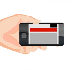
Responsive design is hot, so responsive advertising is hot too. That’s why we see many new ads techniques and strategies. You will find a nice example of technique on Responsive Banner Ads with HTML5 and CSS3. Or maybe the GASP project will bring nice responsive html5 advertisements in future.
Also platforms like responsiveads.com introduce innovative techniques to show banners on responsive websites. And Google had announced to change their Adwords programm to responsive ads starting june of this year.

You will find responsive ads strategies on responsiveads.com too. To get some ideas take a look at their Ad Formats & Showcase page.

At the moment most advertisers have not adopt new responsive techniques. So i was looking for techniques and strategies to show conventional graphical banners on a responsive website. As i wrote earlier in responsive images (Dutch only) we can’t detect phone orientation or even screensize/viewport server side. Javascript can be a bridge between the media query detection of the viewport and the server side scripting. A solution for this is described on Firing Responsive jQuery Functions based on CSS Media Queries Rather than Window Width. The post gives also some other solutions: MediaCheck,jRespond and Breakpoints.js.

I found MediaCheck intuitive and uptodate so i build a proof of concept with it. Based on the viewport i load different banner formats on different positions. You can see the results by viewing the demo page on responisator or download the source on Github.

With MediaCheck you define your breakpoints based on CSS Mediaqueries like:


mediaCheck({
media: '(max-width: 420px)',
entry: function() {
console.log('starting 420');
},
exit: function() {
console.log('leaving 420');
}
});

MediaCheck is initialized with the jQuery Document Ready call so the banners are load after the page loads. This seems the main disadvantage of this method. On the other side this method prevents you from loading too much data to the client. None of the banners is hide or resize by CSS. You can use your banner loads for statistics. Every banner load should be a real view except from changing phone orientation maybe.

Facebook page tabs, nuttig of niet?

facebooktabgroot4blogOnlangs maakte ik een facebook page tab aan. Dat bleek eenvoudiger dan ik had gedacht. Feitelijk is het niets anders dan facebook een i-frame met je eigen content laten tonen binnen de layout van facebook. Tabs vind je bovenaan op de (fan)page standaard staan daar al de tabs “foto’s” en “vind ik leuks”. Voor zo ver ik kon nagaan werkt dit alleen op (fan)page en niet op de facebookpagina zelf.

Wat is het nut van zo’n tab? Mensen hoeven Facebook niet te verlaten, om zich bijvoorbeeld in te schrijven op je nieuwsbrief. Ook kun je via een tab producten verkopen of bijvoorbeeld je updates van Pinterest tonen.

Een goed voorbeeld dat ik tegen kwam is de mogelijkheid om een gratis e-book te downloaden. Op deze manier komt het al dicht in de buurt van de post die ik eerder schreef: Wie heeft er straks nog een website? (2009).

Na die eerste experimentele facebook page tab kreeg ik er opnieuw mee te maken voor de website webvrouw.nl. Deze website heeft een webshop de gebouwd is met Woocommerce. Ik kwam een plugin voor Woocommerce tegen om je webshop te koppelen aan facebook. Langs die weg zijn de producten uit de webshop dus ook via Facebook te bestellen. Meer dan “leuk dat het kan” lijkt het op dit moment nog niet. Het i-frame heeft scollbars wat er niet professioneel uitziet, ook zijn de prijzen niet goed leesbaar. Maar het feit dat het een i-frame is en geen integratie is misschien nog wel het meest teleurstellend. In de eerste plaats ga ik als nog naar de website als ik de winkelwagen bekijk. Andersom is er ook geen interactie met de functies van Facebook zelf, zo kan ik producten niet liken of delen.

facebook page tab webshop webvrouw.nl

facebook tabs webvrouwHet opzetten van een Facebook page tab is dus redelijk eenvoudig. Om een tab goed te laten functioneren is het wel noodzakelijk dat de content die je in het i-frame laadt ook beschikbaar is via https (ssl). Of een tab succesvol is hangt eigenlijk af van de conversie van de tab, m.a.w. hoeveel mensen die je (fan)page bezoeken, bezoeken vervolgens ook de tab. De gebruikte afbeelding van de tab zal mogelijk mede bepalend zijn in die conversie. Qua conversie heb je zelf ook nog invloed op de volgorde waarin de tabs worden weergegeven: Selling Tip: How to Change the Order of Your Facebook Page Tabs.

Behalve de conversie van fanpage naar tab (en vervolgens actie) is het ook belang inzicht te krijgen in de overlap en verschillen tussen de bezoekers van je website en je Facebookpagina. Bij een grote overlap zal de toegevoegde waarde van je tab kleiner zijn.

Tot slot is misschien nog een interessante benadering om te kijken naar de route de andere kant op. Ria Kaashoek van het eerder genoemde gratis e-book. Gebruikt de link naar haar tab in de promotie via bijvoorbeeld twitter. Behalve de direct conversie van tweets naar downloads, heb je in dit geval ook een conversie van de tab naar de fanpage. Uitgangspunt is dan een centrale rol van de facebook page i.p.v. een website.
Voorbeeld facebook page tab

WordPress upgrade naar versie 3.5

WordPress 3.5 is al weer een tijdje uit. Tijd om een aantal sites te upgraden. Hier en daar hoorde ik wel wat geluiden dat de overstap voor problemen zorgde. Na een aantal sites gedaan te hebben ben ik zelf echter nog geen grote problemen tegen gekomen.
Eigenlijk kun je vooral problemen verwachten als je website / blog werkt met een verouderd theme. Verouderde plugins kunnen natuurlijk ook voor problemen zorgen. Deze afhankelijkheid maakt dat je zelf niet altijd meer in de hand hebt of je nog succesvol kunt updaten / upgraden.
Kies je bij de opzet van een website voor een free of premium theme, kijk dan altijd of je kunt verwachten dat het theme indien nodig een update krijgt. Ook voor plugins geldt dat natuurlijk. WordPress.org geeft per plugin aan wanneer de laatste update was.
Gebruik je een plugin die al lang niet meer geupdate is, ga dan eens na wat de reden daarvan is. Zijn er bijvoorbeeld inmiddels betere alternatieven? Is de techniek achterhaalt? Etc.
De websites die ik ondertussen geupgrade heb, hadden o.a. de volgende plugins: Woocommerce, SEO door @Yoast, Addthis.com, Disqus Comment System en W3 Total Cache. Zoveel mogelijk dezelfde en ‘bewezen’ plugins gebruiken voorkomt dus problemen.
@chrissmit maakte een handige lijst van plugins: Basic WordPress plugins: The Basics. Zo’n lijst is een goede start als je gaat beginnen aan een nieuwe wordpress site of je oude website eens wilt opschonen.

Andere tips voor het upgraden; maak altijd een backups. Het beste is een volledige backup van zowel je files als de database.

Zou je leven er dan anders uitzien? #weekzondergoogle

Spruitjes zijn viesEerder deze week schreef ik al over de machtige positie van Google. In Europa gebruikt meer dan 95% van de mensen Google om te zoeken op internet. Google bepaalt dus ook welke antwoorden er beschikbaar zijn voor jouw dagelijkse vragen. Zoek jij en recept en vindt Google spruitjes vies, dan eten jij en je kinderen nooit meer spruitjes. Zou jouw (dagelijkse) leven er dus anders uit kunnen zien als jij je zoekgedrag aanpast?

Sommige Nederlandse websites ontvangen dus relatief veel bezoek vanuit Bing / Yahoo. Deze combinatie van laag zoekvolume met hoge conversie, lijkt een unieke kans voor seo-specialisten. Nu richt ik mij tot de consument, jij dus.

Zoek eens op Google en daarna met dezelfde zoekvraag op Bing. Zoals je ziet vaak totaal andere resultaten. Zou jij het aan durven, als voornemen voor 2013; zoek een week lang eens niet met Google. Thuis niet, onderweg niet en op je werk niet.

Google is toch de beste?

Niet altijd wordt de beste technologie de standaard, klassiek voorbeelden zijn de PC, VHS en het qwerty-toetsenbord. Via het “effect van positieve terugkoppeling” kunnen sommige producten toch de markt veroveren.

Maar google wil toch zelf ook de beste zoekresultaten?

Zou de zoekmachinemarkt volledig door vraag en aanbod bepaalt worden (klassieke theorie). Dan zou de consument inderdaad kiezen voor de zoekmachine met de beste zoekresultaten. Consumenten blijken veel minder kritisch en blijken ook in dit geval erg merktrouw.

Advertenties

Google verdient geld met advertenties. Deze advertenties worden gekoppeld aan de zoekopdrachten. Slechte zoekresultaten en relevante advertenties zullen Google op korte termijn dus meer opleveren. Zolang consumenten hier genoegen mee nemen en blijven terugkomen, is het belang van goede zoekresultaten voor Google steeds ondergeschikter.

Moraal

Google vindt spruitjes vies schreef ik al. Ook over andere zaken kan Google een mening hebben; ‘Naaktfoto’s moeilijker te vinden via Google’. Google zou deze ‘braafste jongetje van klas’-strategie bijvoorbeeld kunnen gebruiken om een positiever beeld te scheppen bij de mededingingsautoriteiten.

Alternatieven

In tegenstelling tot bijvoorbeeld Rusland (Yandex) en China (Baidu) ontbreekt in Europa sowieso aan een serieuze concurrent. Europese zoekmachines of lokale zoekmachines ( waar is Ilse gebleven ? ) zouden mogelijk een betere zoekervaring kunnen geven.

Bing / Yahoo is in de VS de een serieuze concurrentie voor Google. Ook in Europa zal meer concurrentie leiden tot betere zoekresultaten. Jij als consument bent daarin dus bepalend. Ga de uitdaging aan “een week zonder google” #weekzondergoogle.