NB the text below has been written with Twitter’s Bootstrap 3 RC1 in mind. RC2 show important changes, so also read:
 Major points for migration:
- reconsider your base templates
- rename your grid classes
- if you templates don’t use the fluid layout, check nesting rows
- check and reconsider the stacking of elements in the new mobile grid
Base templates
Twitter Bootstrap 3 drops support for IE7 and Firefox 3.x. Following this you don’t need to include html5shiv any more. Including respond.js (not included) will be enough for CSS media querie support in IE8. For Twitter Bootstrap 2.x i used initializr.com to create a base template. For Twitter Bootstrap 3 you can consider to use a minimalistic template as base:
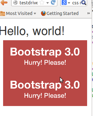
<!DOCTYPE html>
<html>
<head>
<title>Bootstrap 101 Template</title>
<meta name=”viewport” content=”width=device-width, initial-scale=1.0″>
<!– Bootstrap –>
<link href=”css/bootstrap.min.css” rel=”stylesheet” media=”screen”>
</head>
<body>
<h1>Hello, world!</h1>
<!– JavaScript plugins (requires jQuery) –>
<script src=”http://code.jquery.com/jquery.js”></script>
<!– Include all compiled plugins (below), or include individual files as needed –>
<script src=”js/bootstrap.min.js”></script>
<!– Optionally enable responsive features in IE8 –>
<script src=”js/respond.js”></script>
</body>
</html>
This template will be responsive mobile first by default.
Rename your grid classes
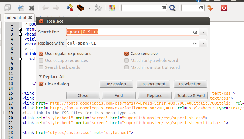
The grid classes for span and offset are renamed form span* and offset* to col-span-* and col-offset-* in Twitter Bootstrap 3. Preform a global search and replace action in your templates files to rename this classes. You could use regular expressions to do this. I use Geany to edit my templates files. Regular expressions like replace “span([0-8]+)” with “col-span-\1” did the trick, see below:
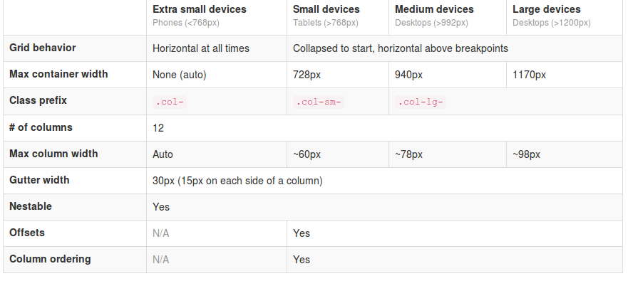
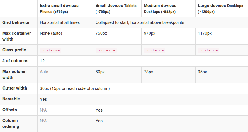
From now Twitter’s Bootstrap defines three grids: Tiny grid for Phones (<480px), Small grid for Tablets (<768px) and the Medium-large grid for Destkops (>768px). The row class prefixes for these grid are “.col-“, “.col-sm-” and “.col-lg-“. The Medium-large grid will stack below 768 pixels screen width. So does the Small grid below 480 pixels and the tiny grid never stacks.Twitter’s Bootstrap 3 defines three grids: Tiny grid for Phones (<768px), Small grid for Tablets (>768px) and the Medium-Large grid for Destkops (>992px). The row class prefixes for these grid are “.col-”, “.col-sm-” and “.col-lg-”. The Medium-large grid will stack below 992 pixels screen width. So does the Small grid below 768 pixels and the tiny grid never stacks. Except for old phones which always will stack the elements (mobile first design). (last update about the grid based on Twitter’s Bootstrap 3 RC1, see also: Twitter’s Bootstrap 3 grid, changing breakpoint and removing padding)
See also http://examples.getbootstrap.com/grid/ for more examples of the grids. Or consider the table below:
Use Less mixins to migrate your grid
The ‘old’ span* will not be the same as col-* or col-lg-*. So replacing the class names in your templates will be give you better results. But when looking to an example like http://examples.getbootstrap.com/jumbotron/index.html you will find the the col-lg-* class in place of the former span* class. This will give you a possibility to create a mixin for span* with the same styles as col-lg-* in this case. Note: The col-lg-* will stack below 992px by default (see: New twitter bootstrap 3 grid, changing breakpoint and removing padding).
Switch to fluid layout
A fluid layout uses percents instead of pixels for column widths. Twitter Bootstrap 2.x let you choose between pixels and percents. In Twitter Bootstrap 3 the grid is fluid by default. So if you didn’t use the fluid grid it’s time to switch now. The most important difference will be the nesting of row. Using percents a nested row should get a total width of 100% too cause it gets its width from its parent. For this reason each nested level of columns should add up to 12 columns in the fluid layout. Who don’t use the fluid layout in Twitter Bootstrap 2.x will used to give a nested row a set of columns that add up to the number of columns of its parent. So find your nested rows and change their columns so their number add up to 12.
The small and tiny grid
In Twitter Bootstrap 3 anything under 768px use the so called small device grid. The small and tiny device grid also have 12 columns and are fluid too. Offsets are not available and you have to use special classes to set the columns. Use the .col-* and .col-sm-* classes for the mobilethese grids.
You can use all grid classes for the same column b.e.:
<div class=”col-span-3 col-small-span-6″>
<div class=”col-6 col-sm-6 col-lg-6″>
The above will give you a column of 50% width in the large grid, but a column of 50% in the smaller grids too. So .col-* and col-sm-* will help you to set the way of stacking the columns on small devices. The col-lg-* classes are never applied on the small grids. Without adding col-6 and col-sm-6 a div with col-lg-6 get 100% width on the small device grids. see: http://www.bootply.com/67209
Also read: Writing Twitter’s Bootstrap with upgrading to v3 in mind
Example
I migrate my free demo webshop template to TB3. After doing the steps above there still will be other thing to fix.
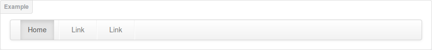
Responsive navbar
In these templates the menu is wrapped in a “Responsive navbar”. Also here class names are changed. The most important change here is the toggle button is now a real <button> with class .navbar-toggle. The .navbar class adds a background color now.
I change the <a> of the toggle button to button and add the .navbar-toggle class. I also add “.navbar {background:none}” to my custom stylesheets. Now the menu works and collapses as before, beside the collapsing point is at 728 pixels now in stead of 940 pixels.
Padding instead of margin
In the templates i wrapped the product boxes in columns of a row. After the migration this don’t fit any more.
In the in change log we could read: “New single grid system (still uses .row) utilizes percentages over pixels, padding instead of margin, and box-sizing: border-box for easy math.”. Each column now got b.e. padding-left: 15px and padding-right: 15px instead of margin-left: 30px;
In the template i add an extra div. This div got my custom classes and will be the parent of the product info code.
<div class=”span3 productitem allround”><div class=”productitemimage”> changed to <div class=”col-4″><div class=”productitem allround”><div class=”productitemimage”>
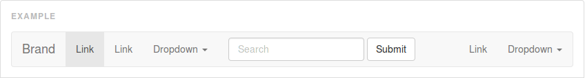
Input-append class
Before i create the search box with the input-append class. With Twitter Bootstrap 3 you should use the input-group class together with a input-group-btn class:
<div class=”input-group col-4″>
<input type=”text”>
<span class=”input-group-btn”>
<button class=”btn btn-search” type=”button”>Search</button>
</span>
</div>
Breadcrumbs
Twitter Bootstrap 3 adds a separator (/) automatic. You don’t need to code the separator yourself and you have to remove the <span class=”divider”>/</span> from your code. The separator is a slash with color gainsboro (#CCCCCC) by default. You could add “.breadcrumb > li:after” to your custom css to change the separator char or its color.
.breadcrumb > li:after {color:#FF0000; content: ” >”;}
Pagination
The pagination class needs to add to the ul-tag direct instead of to the containing div. But when you want to center the pagination you will have add the center class to the containing div. Note Pager links (previous / next) are centered by default.
Download
You can download this Free Twitter Bootstrap 3 template on Github. Test your own templates on http://bootply.com/ now.
Glyphicons
With the launch of Bootstrap 3, icons have been moved to a separate repository.
Responsive images
Twitter’s Bootstrap 2 makes images responsive by default (by adding max-weight:100%). Bootstrap 3 has a special class to make your images responsive. �Use `class=”img-responsive”` to make your images responsive now. See also: Images not responsive by default in Twitter Bootstrap 3.0 RC1?
WordPress Bootstrap 3 Start Theme
I start to migrate the former Skematik theme to Bootstrap 3. This powerful theme framework that can be used as a standalone website builder or as a framework to create child themes for WordPress build on Twitter’s Bootstrap 3. Please give it a try: https://github.com/bassjobsen/jamedo-bootstrap-start-theme. Contributions are welcome 🙂
Migrators
Other useful links:
The migration section in the docs,
Migration Guide, PHP class for migration and Bootstrap migration tools in progress: https://github.com/iatek/bootstrap-migrate
Migrate your Javascript Plugins
Many people wrote Javascript Plugins for Twitter’s Boostrap 2.x. Some examples: Bootstrap-datepicker and Jasny Bootstrap. Most plugins can migrate to TB3 easily, see: How to migrate your Twitter’s Bootstrap Javascript plugins from version 2.x to version 3

